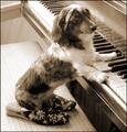
DPChallenge: A Digital Photography Contest You are not logged in. (log in or register
 
Browse Settings
Currently viewing:
Registered UserRiderGal

Show comments:

Per page:

Order:

Comments:


Comments Received by RiderGal
Pages:   ... [91] [92] [93] [94] [95] [96] [97] ... [116]
Showing 931 - 940 of ~1160
Image Comment
Abandoned
01/28/2003 08:10:49 PM
Abandoned
by RiderGal

Comment by Gekker:
this looks like it could be really interesting, I just wish that I could see more of it. The angle is bothersome to me and so is the crop.
Photographer found comment helpful.
Squared Away
01/28/2003 12:04:04 AM
Squared Away
by RiderGal

Comment by KickDrum5150:
This image has great character. A lot of the time that's the hardest thing to find in a photograph, you did it quite well here. Did you try this in B & W? Just wondering.
Photographer found comment helpful.
Squared Away
01/27/2003 07:14:02 PM
Squared Away
by RiderGal

Comment by Cub:
Great catch. Color, DOF, and lighting are good... Cub
Photographer found comment helpful.
Abandoned
01/27/2003 04:10:06 PM
Abandoned
by RiderGal

Comment by Jak:
It seems to me that there was an awful lot to shoot here, but this image has not captured it. Jak 5
Squared Away
01/27/2003 12:28:24 PM
Squared Away
by RiderGal

Comment by calaille:
Good shot. The branches clutter the subject a little too much for my own taste. I am drawn to the RHS of the window frame, where the edge of the window is not parallel to the edge of the picture - perhaps a larger crop area wouldn't make it so obvious? It would have put a little more colour in the picture too.
Photographer found comment helpful.
Advance to the nearest railroad...
01/26/2003 11:52:55 PM
Advance to the nearest railroad...
by RiderGal

Comment by Gracious:
Nice. A little more detail in the snow would enhance this...not easy to do though.
Advance to the nearest railroad...
01/26/2003 02:01:08 PM
Advance to the nearest railroad...
by RiderGal

Comment by blick:
nice range in values, but the sky bleeds out too much.
Advance to the nearest railroad...
01/26/2003 11:55:40 AM
Advance to the nearest railroad...
01/23/2003 12:55:01 PM
Advance to the nearest railroad...
by RiderGal

Comment by Olyuzi:
Nice photo. Long Island???
Virtuosity
01/22/2003 04:23:23 PM
Virtuosity
by RiderGal

Comment by Azrifel:
~~~~Critique Club Comment~~~~

Composition (content)

Good composition and cropping. The angle of the piano creates depth. Because the piano's edges in the frame end well before the frame's corners, you maintain a natural balance between the left and right side of the diagonal. Not only the key's area, but also upper right corner, the lines look realy nice there and are fare more interesting than the other corners. So it keeps the eye there, it draws the interest away from the empty left.
The dog's pose is excellent and very well captured with her face this way. She is in a nice position in the frame and the cropping around her has a nice balance in space to the edges of the frame. She also forms a cross diagonal with the piano, works really well.
The writing on the piano is a nice touch. The piano also looks like it is used very much, as if the nails of the dog have scratched it. :)
Personally I like the slippers, but the necklace is a bit too much. It looks unnatural over the head. Given the white hair in the neck area, a black necklace just around the neck would have been better in my personal and humble opionion.
The bench doesn't look that nice, perhaps more appealing with some textile over it (I wonder, as a Dutchmen, if the word drapery would be the right word).

Background
The balance of lighting is somewhat distracting. The foreground is exposed well, but the background is overexposed with a very bright spot on the keys (and the dog's head). Perhaps turning this situation around to get the light from that bright side could help the exposure. I wonder what it does to the background, would that underexpose? But it could be filled in with a second source of light.
The cable (electricity cable to a lamp?) in the background is out of place. It is not a big problem, it is just that it looks better without it.

Camera Work (Technical)
Interesting shutterspeed. Tough to use it for animals, perhaps that's why the head is a bit softer as the the body; a minor bit of motion blur.
And ISO1000? Difficult exposure indeed, where to gain that extra shutter without creating any more noise..... Maybe the switch the situation around suggestion could help. Nice result given the situation.
Focus, depth and sharpness are good.

Digital Processing (technical)
Excellent toning, I think it works really well with the color of the dog and the piano. Very good balance.


My opinion
I like it, except fot the necklace and left background.
Pages:   ... [91] [92] [93] [94] [95] [96] [97] ... [116]
Showing 931 - 940 of ~1160


Home - Challenges - Community - League - Photos - Cameras - Lenses - Learn - Help - Terms of Use - Privacy - Top ^
DPChallenge, and website content and design, Copyright © 2001-2025 Challenging Technologies, LLC.
All digital photo copyrights belong to the photographers and may not be used without permission.
Current Server Time: 08/21/2025 10:57:19 PM EDT.