Advance to the nearest railroad...by
RiderGalComment by BAMartin: Critique Club Critique
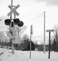
(1) COMPOSITION (CONTENT) I find the layout of this photograph to be interesting but not very strong. You have used the rule of thirds in several ways to the advantage of the photograph. (i.e. the horizon is along the lower line of thirds, two spearate sign poles are along the side lines). The repetition of the "railroad" and "railroad" in the signs is quite humorous.
I like your use of leading lines here, the way all of the power lines seem to be pointing to the railroad crossing sign. It is almost unforgivable to have power lines in a photograph, but you have used them here in a wise way. If you can not get rid of them, then at least use them appropriately.
(2) BACKGROUND The background here is rather cluttered. Unfortunately, I do not see any way around that. Did you try shooting from a lower angle to eliminate some of the distractions?
(3) CAMERA WORK ,TECHNICAL Exposure is very well done. Your exposure keeps the whites very crisp without losing any of the detail. Your blacks are deep and rich.
(4) DIGITAL PROCESSING ,TECHNICAL Your post processing is very good. Cropping this vertically makes for a more interesting photo than if it had been horizontal.
(5)MEETING THE CHALLENGE This photo does a very good job of meeting the challenge. Unfortunately the scene does little to invite the viewer to stay with it longer than a few seconds. It does not say "Wow".
(6) MY OPINION ON THE PHOTO The subject here is rather bland. There are few interesting details and it looks like just another railroad crossing.