Classic Ivy Leagueby
RiderGalComment by CLarson557: Critique Club
Hi Talya!
Before I start, I'd like to comment on your work as a whole. When I do critiques for the club, I study the pictures I'm assigned to for a long time before I start writing. I also check out the photographer's profile to check out other works and get a feel for their style. I am highly impressed with your work and can tell that you have loads of talent. I am especially impressed with your sports photos. You have a good eye and excellent mastery of your camera skills. I definately see you making money with your work. Good luck with your dream of working with Sports Illustrated. Okay...onto the task at hand.
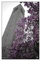
Challenge: I could definately see this amoung a rack of postcards in the college bookstore. You portrayed an important landmark of the college campus that deserves to be shared. You know your subject well and what you wrote in your comments could be written on the back to educate the recipient of the card. The only thing I might possibly add is text on the front to label your postcard. You wouldn't want it to be bold and imposing...just perhaps a small script font in the bottom border of the card. I noticed that in your comments during the voting that people wished they knew what they were looking at.
Composition: Once again, your wonderful eye for effectively portraying your subject is evident here. The angle at which you shot the tower is excellent! The tree with its blossoms does a great job of framing the tower, covering the less interesting areas with its beauty, but staying away from the important upper parts of the tower. Then, the tree's branches continue to sweep over the tower to complete the effective framing. I don't know how more perfect you could get with the composition. Excellently cropped, it fits nicely into the postcard size. The border is appropriate and looks nice.
Technical: The saturation technique you used was very effective here. It still looks very natural. The blossoms against the grey tones looks very nice and provides excellent contrast. The white sky might be a bit stark, especially in the area behind the tree at the midpoint of the picture between the tower and the rest of the building. However, it really doesn't take away from the shot. The biggest problem I do have is the lack of clarity. Because of that, in my opinion, it lacked the "WOW" effect to boost the score during voting. You seem to show the stone texture of the tower well, but the blossoms on the tree are fuzzy and I would have like to see just a little more focus on them without taking away from the depth of the tower. Perhaps also a little boost in the saturation of the purple flowers would help "pop" them out a little more, but may not be necessary if they had more detail.
I hope you find this critique helpful. I thourghly enjoyed studying your work. You have great talent and I wish you the best of luck in your endeavors. Have fun this summer. It sounds like you have exciting learning opportunities ahead of you.
Connie