| Image |
Comment |
| 01/07/2012 02:44:00 AM |
Far away and back homeby mcaldoComment by ubique: I like this. Many will bleat that it isn't a portrait, but it is for me. A picture like this of my late father, for example, would have been a perfect portrait of him.
The conventional approach to portraits is of course the close up head shot with the pimped eyes and grotesquely smoothed skin. Or the gnarly head shot with the grunge processing.
The conventional approach to the challenge topic ('classic portrait' and 'typically captures the face' blah blah blah) is to be constrained by it, rather than liberated by it.
You'll be getting blasted for your audacity, just as did this fellow traveler.
Convention and blind obedience suck, don't they? Why go along, just to produce something two-dimensional and instantly forgettable? So BRAVO you, and please accept my top pick, a 10, and an Order of the Thumb.
Thank you.
 |
 Photographer found comment helpful. Photographer found comment helpful. |
| 01/05/2012 11:27:21 AM |
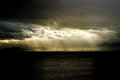
Corporate responsibility & employement , Petrolchemical plants & leukemiaby mcaldoComment by snaffles: Greetings from the Critique Club!
First impression: I call this a 'Hand of God' shot, with the beams of light from the dark cloud coming down to light up the giver of these, as you describe them, poisoned gifts.
Artistic: A very good capture of what's going on...but it's all so tiny!! The viewer has to look to find the subject. It looks like a landscape/seascape shot with a petrochemical company thrown in to break up the horizon. The execution is good but the concept is a little bit of stretch. A title more along the lines of simply 'Chemicals and Cancer' may have worked better, and if you had been able to get someone with leukemia in the foreground (or shot them separately and dropped them in)...that could have made it that much more of a powerful image. We're seeing the cause of the cancer but not the effect.
Technical: This being an outdoor shot, you're a bit limited in terms of comp. A bit centred, could have used more thirds, also burning the highlights in the sky would help kill the glare. And the sheer distance from your subject makes it just too small, unless you cropped way in, which might not have been feasible.
Overall: You did get a pretty good score for this image, so well done. Keep shooting and good luck!
Feel free to PM me with any questions.
Susan |
| Photographer found comment helpful. |
| 01/04/2012 03:57:41 PM |
|
| Photographer found comment helpful. |
| 01/04/2012 01:10:49 PM |
|
| Photographer found comment helpful. |
| 01/03/2012 07:33:02 PM |
|
| Photographer found comment helpful. |
| 01/03/2012 05:00:20 PM |
|
| Photographer found comment helpful. |
| 01/02/2012 11:49:28 AM |
|
| Photographer found comment helpful. |
| 01/02/2012 11:38:00 AM |
Far away and back homeby mcaldoComment by Nusbaum: Wonderful environmental portrait. This says a lot about the subject even though he/she is only represented by a small silhouette. |
| Photographer found comment helpful. |
| 01/02/2012 11:04:38 AM |
|
| Photographer found comment helpful. |
| 01/02/2012 10:22:00 AM |
|
| Photographer found comment helpful. |
Home -
Challenges -
Community -
League -
Photos -
Cameras -
Lenses -
Learn -
Help -
Terms of Use -
Privacy -
Top ^
DPChallenge, and website content and design, Copyright © 2001-2026 Challenging Technologies, LLC.
All digital photo copyrights belong to the photographers and may not be used without permission.
Current Server Time: 06/20/2026 11:06:45 PM EDT.