| Image |
Comment |
| 02/14/2006 11:53:56 PM |
|
 Photographer found comment helpful. Photographer found comment helpful. |
| 02/13/2006 04:09:06 AM |
|
| 02/12/2006 06:13:06 PM |
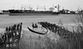
Two Boats and Two Piersby _eugComment by Germaine: To really carry this off, you need to have both boats in sharp focus. Good use of black & white, but there seems to be a lot of noise. |
| 02/09/2006 06:40:29 AM |
|
| 02/09/2006 02:00:18 AM |
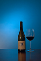
Wineby _eugComment by vadvirag: I found your photo in DrAchoo's thread. I did not read the comments before, I just add a few small issues, maybe they help.
Alltogether a nice shot with only little things that could be done different, I like the shades of blue and the reflection very much. I usually try to avoid plane compositions in one level. I would move either the bottle or the glass a little bit more to the front to give it an essence of depth. A little backlightin would make the wine beautiful transparent, and I also would bring them more to the front in hope of KO-ing the edge of the table and wash the background all together and make the label readable on the bottle. The cleaniness of the glass is another little issue: if you look at it hard, you can see the splash of pouring the wine in. Be more careful, the glass has to be chrystal clear.
Just small things that may improve this one. I hope it helps. Message edited by author 2006-02-09 02:05:33. |
| Photographer found comment helpful. |
| 02/08/2006 07:28:00 PM |
Wineby _eugComment by DrAchoo: The composition is nice. I think I'd prefer just a bit tighter on the crop. The biggest problem is the blue hue makes the wine look very dark and unappealing. In the end, I just don't think it's a good combo, unless you could have backlit the glass with its own light source to bring out some true red.
EDIT: I came back to say the gradient is pretty sweet. I forgot to mention that. I like it. As far as the unexciting mentioned in other comments, well, I looked at it as a product shot. It doesn't have a lot of emotion to it, but it's a nice enough composition for a wine picture. Message edited by author 2006-02-08 19:29:34. |
| Photographer found comment helpful. |
| 02/08/2006 04:22:41 PM |
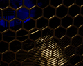
Hexes and Arcsby _eugComment by Cutter: I am going to try to predict what it is for each photo: Yours is .... a metallic cage for bees. |
| Photographer found comment helpful. |
| 02/08/2006 07:45:03 AM |
Wineby _eugComment by Tej: Greetings from the Critique Club!
Aesthetic: As most of the comments suggest - this is not a very "interesting" photo. Not that the subject is not interesting per se, but handling of subject could have been much better to make it impactful.
Technical: No major issues here. Focus is sharp. Maybe spot metering mode would have been helpful in some way. Also shallow depth of field is good in cases where all you need from "background" is smooth color.
Challenge: Though I feel blue background is good enough reason for it to fit the challenge, but somehow I'm not able to focus on the blue. Maybe smaller subject, at the thirds, would have been better.
Conclusion: Oveall an average composition. Since the image is well exposed it has lot of potential to be played with in post processing which could have enhanced otherwise "common" subject. I did not voted for this challenge, but with so many other good submissions this might have suffered a bit of "relative" score syndrome.
I'm by no means expert in area of photography. My comments are purely based on my limited understanding of technology and art behind digital photography. Apart from doing detailed evaluation of your submission, my intent is to learn different styles of photography by critically evaluating selective submissions. If you've got any questions about this critique, please feel free to contact me via email or PM.
Wish you a great day!
-Tej |
| Photographer found comment helpful. |
| 02/08/2006 02:37:05 AM |
Two Boats and Two Piersby _eugComment by PaulE: What a perfect setting. Looking at this I keep thinking that the composition should be better. I'm sure one of the top chaps could help here. |
| Photographer found comment helpful. |
| 02/07/2006 08:59:27 AM |
|
| Photographer found comment helpful. |
Home -
Challenges -
Community -
League -
Photos -
Cameras -
Lenses -
Learn -
Help -
Terms of Use -
Privacy -
Top ^
DPChallenge, and website content and design, Copyright © 2001-2026 Challenging Technologies, LLC.
All digital photo copyrights belong to the photographers and may not be used without permission.
Current Server Time: 07/16/2026 04:07:39 PM EDT.