| Image |
Comment |
| 02/28/2006 10:24:30 PM |
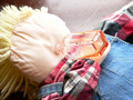
Booze gluttonyby footfungasComment by cpanaioti: *** Critique Club ***
First impressions: Good use of diagonals. Diagonal lines make an image more dynamic.
Exposure: Nothing seems blown out or too dark.
Composition: Good use of diagonals however a lot of the elements included are distracting. The plaid shirt (red is a very strong colour and draws the viewers attention), the very light blank area of the head, the empty space at the top. The bottle does not draw enough attention away from these other items.
Impact: There are too many things in the image that draw the viewers attention. It is best to have the main subject stand out the most. The bottle here fades into the picture rather than jumps out.
Using different items that aren't so distracting (plain shirt rather than plaid) could help draw the viewer's attention to the bottle rather than all over the image.
Good try for a first entry -- don't take the comments too hard.
Keep shooting.
Colette |
| 02/19/2006 04:22:28 PM |
|
| 02/19/2006 01:38:32 PM |
|
 Photographer found comment helpful. Photographer found comment helpful. |
| 02/19/2006 12:54:41 AM |
|
| 02/18/2006 09:05:42 PM |
|
| Photographer found comment helpful. |
| 02/18/2006 11:17:07 AM |
|
| 02/17/2006 12:54:29 AM |
|
| 02/16/2006 09:06:28 PM |
|
| 02/16/2006 12:03:12 AM |
|
| 02/15/2006 06:28:52 PM |
|
| Photographer found comment helpful. |
Home -
Challenges -
Community -
League -
Photos -
Cameras -
Lenses -
Learn -
Help -
Terms of Use -
Privacy -
Top ^
DPChallenge, and website content and design, Copyright © 2001-2026 Challenging Technologies, LLC.
All digital photo copyrights belong to the photographers and may not be used without permission.
Current Server Time: 07/15/2026 02:31:11 PM EDT.