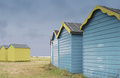
DPChallenge: A Digital Photography Contest You are not logged in. (log in or register
 
Browse Settings
Currently viewing:
Registered UserKHolt

Show comments:

Per page:

Order:

Comments:


Comments Received by KHolt
Pages:   ... ... [103]
Showing 351 - 360 of ~1028
Image Comment
Spun and suspended
09/25/2006 12:17:19 AM
Spun and suspended
by KHolt

Comment by xXxscarletxXx:
Very very pretty
Photographer found comment helpful.
Leaving
09/18/2006 01:52:37 AM
Leaving
by KHolt

Comment by ambaker:
Critique Club Review:

Nice Picture!

You are correct, the blue looks a bit over processed.

I really like the sihouttes of the birds. However, my eye keeps getting drawn to the band of white clouds that run across the center with all the detail there. The brightness there, especially in the right third of the frame, is a bit distracting.

Color saturation and hue, is done very well. Focus is spot on. A little more softness in the clouds would keep the eye on the birds.

Overall this is a very well done photo, and I add my congratulations on your top 20 finish.
Photographer found comment helpful.
Beach Hut 79
09/16/2006 07:57:09 AM
Beach Hut 79
by KHolt

Comment by geewhy:
On scouring the thumbnails after the challenge...this shot caught my eye immediately.

I really like the composition and the way you`ve managed to keep the image within the bounds of the challenge despite having a grassy foreground and a large area of sky.
Really nice work.
Photographer found comment helpful.
Beach Hut 79
09/16/2006 12:46:08 AM
Beach Hut 79
by KHolt

Comment by ambaker:
Critique Club Review:

Good take on the challenge.

I like the lighting, color, contrast, hue, brightness, and saturation.

I also like the way you kept the grass a light green so that it didn't compete witht the rest of the image.

Very good focus and depth of field.

The differing angles of the beach huts is a bit distracting. I imagine that they probably don't want you relocating their beach huts though...

I would have liked to have seen a little more ocean. In the space between the huts. But again, moving huts.... ;-)

The sky color is good, but a little more detail would have been interestng. It's much better than the featurless skys too often seen in photos, but it teases me for a bit more.

Ovreall a very good photo, one I could see hanging on my wall. Congratulations on your top 20 finish.
Photographer found comment helpful.
Leaving
09/14/2006 11:37:47 PM
Leaving
by KHolt

Comment by graphicfunk:
What an impressive overhead! Congratulations on your top 20 finish.
Photographer found comment helpful.
Leaving
09/13/2006 10:12:03 AM
Leaving
by KHolt

Comment by dragonlady:
congratulations..wonderful image with lovely line and color...simple yet elegant.
Photographer found comment helpful.
Leaving
09/12/2006 02:16:39 PM
Leaving
by KHolt

Comment by UNTITLED:
Wonderful color and light, quite dramatic. Very nice!
Photographer found comment helpful.
Leaving
09/12/2006 01:48:45 PM
Leaving
by KHolt

Comment by posthumous:
gorgeous, and I appreciate the use of triplets to give an extra nod to the challenge. I did that as well.
Photographer found comment helpful.
Leaving
09/12/2006 12:40:27 PM
Leaving
by KHolt

Comment by jimness:
I'd say you nailed the timing on this...well done
Photographer found comment helpful.
Leaving
09/11/2006 02:06:43 PM
Leaving
by KHolt

Comment by jrtodd:
I feel the bands across the sky make this a difficult choice for a good ROT photo. Against a clear or even slightly cloudy sky you would have it. Nice photo and the placement of the birds works well.
Photographer found comment helpful.
Pages:   ... ... [103]
Showing 351 - 360 of ~1028


Home - Challenges - Community - League - Photos - Cameras - Lenses - Learn - Help - Terms of Use - Privacy - Top ^
DPChallenge, and website content and design, Copyright © 2001-2025 Challenging Technologies, LLC.
All digital photo copyrights belong to the photographers and may not be used without permission.
Current Server Time: 08/25/2025 05:13:51 PM EDT.