| Image |
Comment |
| 07/29/2003 05:55:47 PM |
|
 Photographer found comment helpful. Photographer found comment helpful. |
| 07/28/2003 12:45:46 PM |
|
| 07/27/2003 06:57:00 AM |
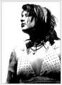
tatt's 'n studsby miss parkerComment by frankenstein: Very good image. I like the raw feel of the shot - the hard, contrasty lighting and the subject's turned head and hidden eyes. well done |
| Photographer found comment helpful. |
| 07/25/2003 07:23:13 PM |
|
| 07/25/2003 01:02:21 PM |
tatt's 'n studsby miss parkerComment by punkdyke: A bit over exposed on the face, but this was obviously intentional, and, I think, effective. Somehow the shirt (?) seems a little out of place on this girl. |
| 07/24/2003 12:43:24 AM |
tatt's 'n studsby miss parkerComment by Twocentz: It's a good picture. But I find it a little to bright up top, and to dark below. Would have been nice to see her tattoo's, and necklaces a bit better. Her necklaces seem to dark for the most part, and her tattoo's seem a bit covered up. But it's all good =) |
| Photographer found comment helpful. |
| 07/23/2003 09:58:00 PM |
tatt's 'n studsby miss parkerComment by miller: Nice stylish shot. I like the contrast and the highlights and shadows are excellent. Only nitpick I have is that the lighting combined with the levels/contrast adjustments make her shoulders disappear. I think it would be nice to see at least some differentiation from the background. You didn't beat me over the head with the trend aspect either, which is good for a shot like this. |
| Photographer found comment helpful. |
| 07/23/2003 09:55:04 PM |
|
| 07/23/2003 08:57:31 AM |
tatt's 'n studsby miss parkerComment by Alpine99: My only 10 this week.. I love the power of this image, only slight niggle would be the tops of the shoulders are lost into the background, it would have been nice to see some definition here. Your model carries the look off very well.. |
| Photographer found comment helpful. |
| 07/22/2003 06:00:42 PM |
|
Home -
Challenges -
Community -
League -
Photos -
Cameras -
Lenses -
Learn -
Help -
Terms of Use -
Privacy -
Top ^
DPChallenge, and website content and design, Copyright © 2001-2026 Challenging Technologies, LLC.
All digital photo copyrights belong to the photographers and may not be used without permission.
Current Server Time: 07/17/2026 11:05:55 AM EDT.