| Image |
Comment |
| 12/13/2005 09:39:24 PM |
|
| 12/13/2005 01:00:18 PM |
|
| 12/13/2005 11:26:17 AM |
|
| 12/12/2005 10:31:37 PM |
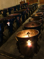
Altarby DarkprincessComment by vikas: This shot would have looked much more amazing if it was cropped little more closely from top and bottom. Another thing that would have made it stand out is the blue color of the stands. |
| 12/12/2005 07:56:56 PM |
|
| 12/12/2005 03:34:22 PM |
|
| 12/12/2005 03:23:55 PM |
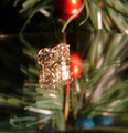
Your tree shouldn't be the only thing sparkling this Christmas!by DarkprincessComment by Beetle: I appreciate the effort, you really tried to do a christmas catalog item. However, I find that reflection hard to look at - I guess it is because there is more than ONE reflection, there seem to be several layers of it.
The placement of the studs could be better, too - this is too close to dead center, but not even quite there. |
| 12/12/2005 09:51:49 AM |
|
| 12/12/2005 01:46:43 AM |
|
| 12/12/2005 12:24:03 AM |
|
Home -
Challenges -
Community -
League -
Photos -
Cameras -
Lenses -
Learn -
Help -
Terms of Use -
Privacy -
Top ^
DPChallenge, and website content and design, Copyright © 2001-2026 Challenging Technologies, LLC.
All digital photo copyrights belong to the photographers and may not be used without permission.
Current Server Time: 07/17/2026 02:09:51 AM EDT.