Impassionby
payambComment by HBunch: *Critique Club*
Per your request, here is your in depth critique from the Critique Club.
I see that you only found the 'full of praise' comment as helpful, and the one that actually suggests ways to improve the photo you did not find helpful, so, in that respect, I'm not sure if I'm going to be of help either, since I agree with uleau.
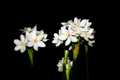
To elaborate a bit, the first thing I notice when I look at the shot is the actual size of the shot. it's only 480x320. The image seems a little small to me, and makes the detail a bit more difficult to comprehend. My first suggestion would be to use the full 640 size that DPC allows. Make your longest side 640 when resizing your photo. Remember, don't resize UP to get that size.
Second, the focus looks a bit soft. Note that if you used shallow DOF on the photo, the size of the photo being so small may simply just make the whole thing look out of focus as it does in fact look. If you were going for a soft focus look, I don't think it works for this particular shot.
I don't know what your intentions for the photo were, since you did not include any photographer's comments when asking for this critique, so I can really only offer you my own personal opinion. For more technical critiques, in the future, please include photographer's comments when asking for a detailed critique.
I like the lighting. I think it makes the white flowers stand out nicely on the black background, and with the solid black, I find nothing distracting about the background.
I think that the positioning of the flowers looks a bit hap hazard.The stalks in the center bottom of the photo look out of place and I don't prefer the way the stem goes out through the bottom of the image. It leads our eyes right out of the photo. I would personally try to eliminate the tiny flower bunch near the bottom and draw attention back up to the 2 main flower bunches.
The patterns are nice, and I think this fits the challenge nicely.
Overall, nice contrast in the subject and background, but needs to be larger for more detail, and also a more crisp focus would be preffered.
~Heather~