|
|
|
Showing 881 - 890 of ~950 |
| Image |
Comment |
| 01/26/2006 02:00:29 PM | |  Photographer found comment helpful. Photographer found comment helpful. |
| 01/26/2006 09:25:47 AM | | | Photographer found comment helpful. |
| 01/26/2006 05:59:46 AM | The Signs of Sorrow come from the eyesby KrisbyComment by Krisby: Thanx so much for that :) just what i needed to hear.. And with the blurr it is probably bouth my and the cameras problem.. Trying my best keeping still :) I'll get better with time.. :) |
| 01/25/2006 10:01:32 PM | The local time in Iceland is..by KrisbyComment by LoudDog: Greetings from the on request Critique Club!
There is that focus problem. You meet the challenge in an obvious way here but there are a few other problems. Your editing made the image really grainy. Not sure if that was intentional or not, but with the textured wall it’s too much for me. The background is the biggest downfall of the shot in my opinion. Too shiny, too much texture, and it simply draws too much attention away from your subject. As for the subject, I think the clock alone and a different title would have faired better.
I do like the shadow and that you composed it with the rule of thirds. More crisp and a different background and I’d give you a 6.
Good luck and keep working on it. I’m expecting you to have the top image for your camera here real soon.
| | Photographer found comment helpful. |
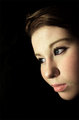
| 01/25/2006 09:40:34 PM | The Signs of Sorrow come from the eyesby KrisbyComment by LoudDog: Greetings from the on request Critique Club!
First off, excellent photo! The low score is only because you didn’t even come close to meeting the challenge. If you want to score well you kind of have to meet the challenge, usually in an obvious way. In the portrait challenge this would score a 6 or 7 from me.
What I like about the image: it conforms to the rule of thirds, very well lit, I love the eyes and the way they look off out in the darkness, and the black background accents your face perfectly.
What I don’t like; you said this one wasn’t blurry, but it’s sure not crisp either. I’m assuming this is a self portrait, in that case, it’s hard to focus because the camera sets the focus when you start the timer and not when you are in front of the camera. Thus, you need to set up a prop where you’ll be to get the focus right, or use manual focus. Or it might be the camera, do you have problems getting images in focus normally? Also, in the title you are going for sorrow, but the image doesn't say sorrow to me. You look more optimistic or in deep thought. For sorrow, try looking down.
Look at the bright side though; you have the 6th highest scoring image ever on DPC with your camera!!!
| | Photographer found comment helpful. |
| 01/25/2006 06:23:07 PM | Marbles and Blueby KrisbyComment by strangeghost: TECHNIQUE
Colors are generally vibrant and bright, but there is a yellowish caste to the whole image that makes it look a little dingy. This may be the result of a mismatch between the white balance your camera was expecting, and the actual light available at the scene. Also, the glare on the front of the jar is distracting. If the scene was lit with natural light, try to find a way to diffuse the light a little (curtains, drape a sheet across the window, etc.). If you're shooting with flash, don't. Find a way to light the scene more indirectly. If there's not enough light to do this, use a tripod and a longer exposure. Avoid the built-in flash of your camera at all costs. Makes for ugly reflections. Those blown glare lines can make an otherwise excellent picture stumble. The focus appears to be a little off also. The marbles are a little fuzzy looking, as is the top edge of the jar. If there's one thing that DPC tends to find unforgivable, it's a failure to focus "sharply." Your picture gave no technical details, but perhaps you used a very small "f number" (e.g., f2.8) which means your pictures will have a very narrow range where the image is in focus, with foreground or background objects being out of focus. This is desirable for some shots but perhaps not this one?
COMPOSITION
You tilted perspective adds interest and and element of unbalance to the photo that I like. What feels a little awkward is the way you've chopped off the top of the jar, left another background object partially visible at the upper right, and have the different color backdrops (shelf, counter??). If you're going to leave an object "in place" to shoot it for this, take great care to make the background as much a part of the composition as the subject.
EMOTIONAL IMPACT
In general, this picture lacks punch or what many DPCers refer to as the "wow factor." It doesn't make you stop and stare. It doesn't drop the jaw. As you said in your photographer's comment, it's just your marble collection. When shooting a picture of a common or otherwise uninteresting object, find a way to make it pop. Experiment with unusual lighting, such as backlighting, which can be interesting when your subject is made of glass. Or try for an unusual perspective (up real close) or put the marbles in a place were you normally wouldn't expect to see them (a wine glass??). Etc. Find a way to make your picture stand out from the pack. Make sure you nail the technical details, pay attention to composition. And keep shooting!
| | Photographer found comment helpful. |
| 01/25/2006 04:19:54 PM | | | Photographer found comment helpful. |
| 01/25/2006 03:22:10 PM | | | Photographer found comment helpful. |
| 01/25/2006 01:58:37 AM | | | Photographer found comment helpful. |
| 01/25/2006 01:48:50 AM | | | Photographer found comment helpful. |
|
Showing 881 - 890 of ~950 |
Home -
Challenges -
Community -
League -
Photos -
Cameras -
Lenses -
Learn -
Help -
Terms of Use -
Privacy -
Top ^
DPChallenge, and website content and design, Copyright © 2001-2026 Challenging Technologies, LLC.
All digital photo copyrights belong to the photographers and may not be used without permission.
Current Server Time: 06/21/2026 02:12:44 AM EDT.
|