| Image |
Comment |
| 05/25/2006 11:21:47 AM |
DPC-ish don't you think? :)by KrisbyComment by Ben: Gorgeous vibrant colours just give life to this shot.
The focus on the Gerbera is perfect and the closeness of the flowers has a strong impact.
Great photo. |
 Photographer found comment helpful. Photographer found comment helpful. |
| 05/25/2006 05:41:35 AM |
|
| Photographer found comment helpful. |
| 05/24/2006 11:50:07 PM |
|
| Photographer found comment helpful. |
| 05/24/2006 08:39:40 PM |
|
| Photographer found comment helpful. |
| 05/24/2006 03:02:10 AM |
|
| Photographer found comment helpful. |
| 05/23/2006 02:28:20 PM |
DSCN1116b2.jpgby KrisbyComment by trnqlty: Cool shot! Love the make up done in this one and the near abstract feel to it. A couple things I would try to fix. The eyes have a green cast in them that is very unnatural which is kind of suprising because the blue looks great. The only other thing i might experiment with is cropping so the eye brows are at the top of the frame. It just seems a little awkward having them so low. Just an idea but overall this is one my favorite shots of yours. |
| Photographer found comment helpful. |
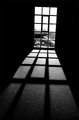
| 05/23/2006 02:28:03 PM |
The Sunshine's Eclipse Windowby KrisbyComment by Aeroglyphics: I really like this photo, especially the shadow play from the window. The only things I can see that might improve it is maybe leveling the window and making the parking lot in the background bokeh. |
| Photographer found comment helpful. |
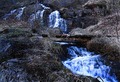
| 05/23/2006 02:25:52 PM |
At The Fishermans Capenby KrisbyComment by Sunniee: The crop is awkward, but that makes me like it more, it adds tension to the shot...gives it a certain "feel" that I'm not sure how to explain.... nice job on the post processing.... |
| Photographer found comment helpful. |
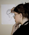
| 05/22/2006 08:04:26 PM |
A Portrait Of A Portraitistby KrisbyComment by Canadian_eh: Really great idea! Wish you could have had more of an easil type set up to get more of an artsy feeling ( easil- did i spell that right?) Anyway, Something that we could see your great work, and face! From what i see, You would have looked great in a simple full face portrait, and with advanced editing, you could have gone any way with it. Nice job tho |
| Photographer found comment helpful. |
| 05/22/2006 07:37:50 PM |
At The Fishermans Capenby KrisbyComment by ArpeggioAngel: I really like the muted tones used for this photo. I think it looks much better than if it had been done "bright". I do agree with previous comments though that the crop seems a little awkward. |
| Photographer found comment helpful. |
Home -
Challenges -
Community -
League -
Photos -
Cameras -
Lenses -
Learn -
Help -
Terms of Use -
Privacy -
Top ^
DPChallenge, and website content and design, Copyright © 2001-2026 Challenging Technologies, LLC.
All digital photo copyrights belong to the photographers and may not be used without permission.
Current Server Time: 06/21/2026 01:30:47 PM EDT.