| Image |
Comment |
| 03/29/2006 08:22:50 PM |
|
| 03/29/2006 03:56:12 PM |
|
 Photographer found comment helpful. Photographer found comment helpful. |
| 03/29/2006 01:49:02 PM |
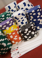
All Inby dpattersonComment by ticktockdoc: Colorful chips. The out-of-focus cards tend to distract more than add to the effect. May have been just as effective with the cards face down but sharper. |
| Photographer found comment helpful. |
| 03/29/2006 12:03:01 PM |
|
| Photographer found comment helpful. |
| 03/27/2006 11:43:50 PM |
|
| 03/27/2006 10:18:58 PM |
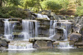
Tranquilityby dpattersonComment by theSaj: often done, but done nicely here....
I'd dodge/burn the top to darken it so it doesn't distract... |
| 03/27/2006 07:00:35 PM |
|
| Photographer found comment helpful. |
| 02/27/2006 08:46:33 PM |
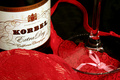
After the Receptionby dpattersonComment by Rikki: Greetings from the Critique Club
My comments here are unbiased and are meant as constructive criticisms ;) Now on to the show:
First off, as a thumbnail, the image grabs my attention. That's a great thing in a field of many. Let your thumbnail stand out so people seek it out. However, much to my disappointment, the full size image didn't necessarily have the same punch as the thumbnail. The champagne label looks like it's floating simply due to the lighting. The edge of the bottle isn't clear so there is no grounding the label. The use of lingerie is nice and alluring but lingerie are meant to be soft and seductive. I would suggest draping it as opposed to just putting a glass over it.
the red has a nice powerful punch to it which I like very much. The element in this photo has a great concept behind it but just lacked a bit in execution. I know you'll do better next time.
Light and detail is the key to make your audience stop and let the image sink in. As always, these are just my personal opinions on this image. Please take it with a grain of salt. We are all out here to learn ;)
Keep on shooting and continue to learn from the folks in our group!
Cheers!
Rikki |
| 02/21/2006 06:51:40 PM |
|
| 02/20/2006 04:19:33 PM |
|
Home -
Challenges -
Community -
League -
Photos -
Cameras -
Lenses -
Learn -
Help -
Terms of Use -
Privacy -
Top ^
DPChallenge, and website content and design, Copyright © 2001-2026 Challenging Technologies, LLC.
All digital photo copyrights belong to the photographers and may not be used without permission.
Current Server Time: 07/15/2026 03:33:21 PM EDT.