| Image |
Comment |
| 07/17/2006 07:40:59 AM |
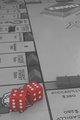
Advance to GOby NuzzerComment by atupdate: The title doesn't fit the image. To be 10 spaces from Go you would be on Go To Jail (I think that is the square under the dice). This image could also use one of the game pieces in it to help it look like an active game. My suggestion would be to shoot from the Go corner with an equal number of squares on each side of Go and use a square crop. Put the game piece a couple of squares before Go and title it Collect $200 (USA game value, sorry). The square crop would give it a game board feel with some negative space in the upper right corner. I think the color of the dice could be a little richer also but I'm not sure which color/hue would need to be tweaked. |
 Photographer found comment helpful. Photographer found comment helpful. |
| 07/17/2006 06:54:36 AM |
Low Tideby NuzzerComment by Rino63: * Greeting from Critique Club *
Before to write the critique I have read the comment of DrAchoo. It's difficult to write other after that comment that I subscribe.
Best regards |
| Photographer found comment helpful. |
| 07/17/2006 12:56:42 AM |
Advance to GOby NuzzerComment by klstover: I agree with the previous comment about the crop - either that, or just under the Y with a bit looser to the right. I like the positions of the dice on the board and relative to each other and the hotels/houses/motels/cities/plastic things. I also like how the plastic housey things are placed on the board - they are in the correct places but not 100% perfectly set. It makes me feel like somebody is actually playing a game, and not that this was a set-up shot, and I like that feeling of reality. |
| Photographer found comment helpful. |
| 07/17/2006 12:19:12 AM |
Advance to GOby NuzzerComment by Lorene: I like the use of black and white while keeping the dice red. I think it might look better if you cropped it just below the Chance cards toward the top, avoiding distractions to the foreground/subject. This shot has a lot of potential to be cool. |
| Photographer found comment helpful. |
| 07/16/2006 10:50:22 PM |
|
| Photographer found comment helpful. |
| 07/16/2006 05:18:12 PM |
Advance to GOby NuzzerComment by Tygerr: Needs a bit of a boost in contrast (there's no real black or white in the image - all shades of gray), but otherwise a really nice photo. |
| Photographer found comment helpful. |
| 07/16/2006 03:33:58 PM |
|
| Photographer found comment helpful. |
| 07/16/2006 12:35:24 PM |
|
| Photographer found comment helpful. |
| 07/16/2006 05:03:27 AM |
|
| Photographer found comment helpful. |
| 07/15/2006 09:42:03 PM |
Advance to GOby NuzzerComment by digitalknight: Great creative - love this idea
Would love to see more contrast - whiter whites - blacker blacks - I think this would push your reds too - I would love to see those more saturated.
Maybe from a compositional standpoint, shoot so the lines of the board are at harsher angles to the edges of your frame and I think you'll find a stonger composition.
Great idea though - nice work. |
| Photographer found comment helpful. |
Home -
Challenges -
Community -
League -
Photos -
Cameras -
Lenses -
Learn -
Help -
Terms of Use -
Privacy -
Top ^
DPChallenge, and website content and design, Copyright © 2001-2026 Challenging Technologies, LLC.
All digital photo copyrights belong to the photographers and may not be used without permission.
Current Server Time: 06/21/2026 02:44:40 PM EDT.