| Image |
Comment |
| 05/14/2007 11:14:17 PM |
|
 Photographer found comment helpful. Photographer found comment helpful. |
| 05/14/2007 03:29:07 AM |
|
| Photographer found comment helpful. |
| 05/14/2007 02:11:06 AM |
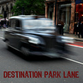
Destination Park Laneby NuzzerComment by escapetooz: very nicely done! it's almost making me dizzy! lol. I'm usually not to big a fan of car motion images as they turn out a little cheesy but this one was done quite nicely with very little distracting factors. |
| Photographer found comment helpful. |
| 05/08/2007 12:38:17 AM |
In Good Companyby NuzzerComment by ericwoo: Hey there from the Critique Club
Camera Work/Technical: Very well-done. I will be the first to admit that I detest the expert editing rule set. Even still, I appreciate the time and effort that goes into an image like this. This is one of the best ones that I have seen done. The only figure that is a little awkward is the one at front on the left. I think toning the lightness down on him just a bit would have helped out a good deal.
Lighting: Well-done outside the figure I mentioned. You really convey the feeling of a small-town pub very well.
Composition/Content: Very nice. You put together a strong image that fit well within the rule set.
My Opinion: Again, I hate the rule set, but I really like what you put together. I think the score fit the image well. Congrats on another well-scoring entry.
Thank you for the opportunity to provide a critique on your entry,
Eric |
| Photographer found comment helpful. |
| 05/07/2007 11:36:27 PM |
|
| Photographer found comment helpful. |
| 05/07/2007 12:01:26 PM |
Snapshotsby NuzzerComment by ursula: Greetings from the Critique Club
Challenge: Meets the challenge description.
Strong points: The 3 overlapping windows combined with colour on B/W give this scene a lot more interest than it might have had all on its own. The sky is beautiful. The little sailboats draw you in.
Possible weak points: Very strict interpreters of "triptych" had a problem with this. The image looks a bit overprocessed. It is a rather centred composition, even though the horizon line is not at centre.
Technicals: The exposure/shutter speed combo you used looks to be right on. Your presentation is excellent. The processing looks (to my eyes) just a bit too strong (oversaturation in the coloured areas, too much contrast at the expense of detail).
Overall: A beautiful entry for Triptych, and you got an excellent score to go with it. Congratulations!
~Ursula |
| Photographer found comment helpful. |
| 05/06/2007 03:52:32 PM |
Snapshotsby NuzzerComment by TooCool: I think the color parts or overprocessed... EG: Your water is green and your clouds look overly Heida'd. But the overall idea is great!
TC |
| Photographer found comment helpful. |
| 05/06/2007 01:29:26 PM |
In Good Companyby NuzzerComment by Haneck: Very cool! This is such a fun idea - I have to try it sometime! I wonder though... It seems like all the guys on the right of the shot are all the same distance away. I wonder if it would look more interesting if one was a little closer, one a little farther... if the distance was more varied or something. But it's still pretty cool. GOod job! |
| Photographer found comment helpful. |
| 05/06/2007 06:10:48 AM |
|
| Photographer found comment helpful. |
| 05/05/2007 08:50:26 PM |
|
| Photographer found comment helpful. |
Home -
Challenges -
Community -
League -
Photos -
Cameras -
Lenses -
Learn -
Help -
Terms of Use -
Privacy -
Top ^
DPChallenge, and website content and design, Copyright © 2001-2026 Challenging Technologies, LLC.
All digital photo copyrights belong to the photographers and may not be used without permission.
Current Server Time: 06/24/2026 05:51:34 AM EDT.