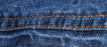
DPChallenge: A Digital Photography Contest You are not logged in. (log in or register
 
Browse Settings
Currently viewing:
Registered Useralpharich

Show comments:

Per page:

Order:

Comments:


Comments Received by alpharich
Pages:   ... [51] [52] ... [85]
Showing 481 - 490 of ~843
Image Comment
Sunflower in the rain
10/19/2006 06:00:30 PM
Sunflower in the rain
by alpharich

Comment by RachelFar:
just beautiful
Photographer found comment helpful.
Sunflower in the rain
10/19/2006 12:19:24 PM
Sunflower in the rain
by alpharich

Comment by Haneck:
gorgious shot!
Photographer found comment helpful.
Sunflower in the rain
10/19/2006 06:42:01 AM
Sunflower in the rain
by alpharich

Comment by queenzenmom:
Nice crisp droplets - :O_O:
Photographer found comment helpful.
Sunflower in the rain
10/18/2006 11:28:20 PM
Sunflower in the rain
by alpharich

Comment by mssnare:
this is a great shot. Only thing that is a little distrating is the dof. I think if all of the drops and pedals were in focus it may enhance the photo a bit.
Photographer found comment helpful.
Coffee
10/16/2006 01:49:13 PM
Coffee
by alpharich

Comment by lauraodom:
Meets Challenge - 2
Lighting/Composition/Processing - 2
Overall Impression - 1
"WOW" factor - 0
Score: 5
Photographer found comment helpful.
sunset on an industry
10/09/2006 10:54:27 PM
sunset on an industry
by alpharich

Comment by posthumous:
beautiful, almost-abstract landscape with level after level going backwards into a flurry of birds. 8
Photographer found comment helpful.
sunset on an industry
10/08/2006 05:01:38 PM
sunset on an industry
by alpharich

Comment by e301:
Nice graduation of tones through the receding countryside, although that forms but a small part of this image. The scattering of birds is messy and indistinct, certainly at the resolution I use (and many others), and perhaps there just isn't enough industrial stuff to make your point. I wonder if a crop in from the right, placing the chimneys more orthodoxly, and allowing you that little bit extra iamge size, relatively, might have worked better for here. I could appreciate that this might make a fine large print - but that's rarely of effect on DPC.
Photographer found comment helpful.
Like chalk & cheese
10/06/2006 11:01:12 AM
Like chalk & cheese
by alpharich

Comment by brownsm:
a different perspective would have worked better here. the contrast of the colors and textures is interesting. but the composition is somewhat boring.
Photographer found comment helpful.
Like chalk & cheese
10/05/2006 12:22:36 AM
Like chalk & cheese
by alpharich

Comment by danderson107:
That may be the nastiest meal I've heard of yet.
Photographer found comment helpful.
Blue jeans
10/04/2006 08:36:15 PM
Blue jeans
by alpharich

Comment by lkn4truth:
CRITIQUE CLUB COMMENT:

Keep your chin up...the following critique is a little rough to read. Don't take it too personally....take what you find usefull and forget th rest! :)

IMAGE QUALITY

The image quality is good but unfortunately the image fails to score high for two primary reasons. First, the image is not "abstract" enough. In abstract the idea is to have the subject not be immediately recognizable. This shot is very easy to figure out. Secondly, the macro part fails because it's just not macro enough. When I think macro I'm thinking REAL close like at least 1:1 ratio or greater (more like 4:1 or 5:1) Looks like you shot this with the 18-70 lens and that lens just doesn't give you a nice enough macro for this challange in my opinion. That's not your fault. I just might not have entered this challenge with that lens to work with.

CHOICE OF SUBJECT

The choice of subject hurt you because again, it's too readily identifiable. You'd have been better off shooting something people don't see every day, especially if your lens limits your macro ability. By shooting something people don't see every day or don't see in that perspective you could get away with not having a good macro lens.

COMPOSITION

The composition doesn't do anything for me either unfortunately - too many straight horizontal lines. Perhaps if you would have focused on a rivet and off centered it a little or focused on some stitching that zigged and zagged around a little it would have drastically helped the composition.

CREATIVITY

I'd deduct a point on creativity for titling the photo "Blue Jeans" because again, the idea is to be abstract (not identifiable) so you really don't want to identify the subject in your title.

POST PROCESSING

The post processing is fine. You might have gotten a better look if you increased the contrast a bit more and maybe even darkened the photo a bit.

By the way, nice camera! I've got the Minolta 5D and then Minolta sold out to Sony and I was very upset. When the first Sony DSLR came out for the Minolta mount I read up on it and it seems like a sweet camera. Hope you enjoy it!
Photographer found comment helpful.
Pages:   ... [51] [52] ... [85]
Showing 481 - 490 of ~843


Home - Challenges - Community - League - Photos - Cameras - Lenses - Learn - Help - Terms of Use - Privacy - Top ^
DPChallenge, and website content and design, Copyright © 2001-2025 Challenging Technologies, LLC.
All digital photo copyrights belong to the photographers and may not be used without permission.
Current Server Time: 08/10/2025 09:57:55 PM EDT.