| Image |
Comment |
| 09/15/2012 10:33:23 PM |
|
 Photographer found comment helpful. Photographer found comment helpful. |
| 09/13/2012 11:37:32 PM |
|
| Photographer found comment helpful. |
| 09/13/2012 01:32:11 AM |
|
| Photographer found comment helpful. |
| 01/25/2011 05:23:13 PM |
|
| Photographer found comment helpful. |
| 01/20/2011 03:35:01 PM |
|
| Photographer found comment helpful. |
| 01/19/2011 10:50:51 AM |
One Penny from 1910by alpharichComment by EL-ROI: Sharp, crisp, great texture and lovely golden hues! The depth of the top of the coin is shown with the petina but not by shadows. |
| Photographer found comment helpful. |
| 01/19/2011 04:38:21 AM |
|
| Photographer found comment helpful. |
| 02/02/2010 10:42:14 PM |
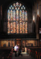
Looking for Godby alpharichComment by JacksonGariety: Your critique as requested! (:b)
Oooh! Very interesting shot. The "One in 7 Billion" is presented very nicely here, with the rows of seats and soft-focus stained glass window above portraying many figures. I really like the entire feel of the image, but editing has done some strange things to the lighting on the wall. That can be easily fixed and is no compositional error. there is one however that really bothers me, the angle and crop. No matter how I look at this I can't get over the angle at which you took this. I love the detail on the person, the colors, the rows, that glass above, but I always disliked off-center church shots. As the entire building is very symmetrical, (I am assuming) I find it odd that you chose to stand off to the side in taking the picture. Also, the modern lights in the upper left and right take you out of the mood just a little. Changing your camera angle could have helped make the photo more interesting by leaving out those lights and getting in closer to the subject a bit. overall, great shot, there are just some compositional and technical errors that need to be fixed. otherwise, great idea, creativity, and coloring. 6/10
-  ColemanGariety ColemanGariety - Message me if you have any questions! :D
The DPChallenge Critique Club.. |
| 01/09/2010 04:32:08 PM |
Looking for Godby alpharichComment by brumer0: I like this a lot. It wouldve been nice for it to be straight. I can see you judged straight by the right side of the window, but it still looks crooked. Its always difficult (for me anyways) to decide where to base 'level' on. |
| Photographer found comment helpful. |
| 01/08/2010 02:48:15 PM |
|
| Photographer found comment helpful. |
Home -
Challenges -
Community -
League -
Photos -
Cameras -
Lenses -
Learn -
Help -
Terms of Use -
Privacy -
Top ^
DPChallenge, and website content and design, Copyright © 2001-2026 Challenging Technologies, LLC.
All digital photo copyrights belong to the photographers and may not be used without permission.
Current Server Time: 07/26/2026 02:55:38 PM EDT.