| Image |
Comment |
| 12/23/2003 11:22:45 PM |
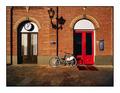
3v8by ecluseComment by nicklevy: I like it, the bicycle doesn't seem to be the clear subject to my eyes but i like the photo (6) |
| 12/22/2003 07:36:47 PM |
|
| 12/21/2003 04:44:32 AM |
3v8by ecluseComment by HRoxas: The colors and the lighting of this photo creates an interesting mood to it. I'ts the best photo of a bike in the challenge. |
| 12/20/2003 06:41:34 AM |
3v8by ecluseComment by sersal: I think you should had cropped the bottom. Very nice shot. |
| 12/20/2003 12:51:16 AM |
3v8by ecluseComment by Antepater: well framed by the doors, and I enjoy the lighting. I would have like to see it a little tighter on the bike. Nice photo |
| 12/20/2003 12:45:34 AM |
3v8by ecluseComment by cbeller: You don't need such a large border. It really takes away from the shot. |
| 12/19/2003 12:42:15 AM |
3v8by ecluseComment by Spork99: I like this, the more I look, the more I like. Symmetrical Asymmetry. Very cool. |
| 12/18/2003 10:22:48 PM |
3v8by ecluseComment by W.R.Miller: I really like this photo. I like the contrast of the set of darker doors and then the set of red doors on the right. I also like the shadows that are being cast especially by the lamp. I would have preferred it without the border though. Atleast for the challenge anyway. Border would have been nice when you add it to DPCPrints.com. Good luck! |
| 12/18/2003 10:51:13 AM |
3v8by ecluseComment by bil99: compistionally it'd be stronger if you were perpendicular to the wall |
| 12/18/2003 10:03:36 AM |
3v8by ecluseComment by Polar7: Quite nice. I like this composition. Amazing how large those doors are compared to the bike. |
Home -
Challenges -
Community -
League -
Photos -
Cameras -
Lenses -
Learn -
Help -
Terms of Use -
Privacy -
Top ^
DPChallenge, and website content and design, Copyright © 2001-2026 Challenging Technologies, LLC.
All digital photo copyrights belong to the photographers and may not be used without permission.
Current Server Time: 07/02/2026 08:29:11 AM EDT.