DPChallenge: A Digital Photography Contest You are not logged in. (log in or register
 
Browse Settings
Currently viewing:
Registered Userrynoesco

Show comments:

Per page:

Order:

Comments:


Comments Received by rynoesco
Pages:  
Showing 31 - 40 of ~49
Image Comment
soda+pop rocks = death
11/07/2002 08:48:00 AM
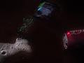
soda+pop rocks = death
by rynoesco

Comment by inspzil:
This photo is too dark. I'm not really sold on the composition of it either. That may be because I had a similar idea (great minds think alike :) ). I think the portrayal of this could've been better or at least on this photo, a little more exposure would be a substantial improvement. - Inspzil
soda+pop rocks = death
11/06/2002 09:05:00 PM
soda+pop rocks = death
by rynoesco

Comment by Ricky Cleave:
no way dude thats such a rad feeling.
soda+pop rocks = death
11/06/2002 02:50:00 PM
soda+pop rocks = death
by rynoesco

Comment by karmat:
cool shot, but needs a lot more light to be totally effective, I think. karmat
soda+pop rocks = death
11/06/2002 02:08:00 PM
soda+pop rocks = death
by rynoesco

Comment by Gekker:
I think that this is just too dark.
soda+pop rocks = death
11/05/2002 07:58:00 PM
soda+pop rocks = death
by rynoesco

Comment by Jacko:
Yes, I totally forgot about this one. Nice choice of superstition. Picture seems a bit dark. Great idea. jacko.
soda+pop rocks = death
11/05/2002 04:09:00 PM
soda+pop rocks = death
by rynoesco

Comment by decoteau:
Good concept, but too dark.
soda+pop rocks = death
11/05/2002 08:05:00 AM
soda+pop rocks = death
by rynoesco

Comment by catpixel:
I like the triangle formed by the objects. The picture should be less dark, because we need to see each more clearly.
soda+pop rocks = death
11/05/2002 07:17:00 AM
soda+pop rocks = death
by rynoesco

Comment by chrysalis:
Good photo. Not sure on theme.
soda+pop rocks = death
11/04/2002 11:32:00 PM
soda+pop rocks = death
by rynoesco

Comment by NotHomeYet:
nice idea, but not enough lighting. hard to see.
soda+pop rocks = death
11/04/2002 11:26:00 PM
soda+pop rocks = death
by rynoesco

Comment by Marsha:
Cool idea. I think it may look even better if there was not so much empty space in the middle.
Pages:  
Showing 31 - 40 of ~49


Home - Challenges - Community - League - Photos - Cameras - Lenses - Learn - Help - Terms of Use - Privacy - Top ^
DPChallenge, and website content and design, Copyright © 2001-2025 Challenging Technologies, LLC.
All digital photo copyrights belong to the photographers and may not be used without permission.
Current Server Time: 06/17/2025 08:29:03 AM EDT.