Kira's Stormby
storm_morrisComment by CEJ: Hello from the Critique Club!
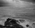
I have studied your image and have the following to offer:
Composition/perspective - right off the first thing that strikes me is that the image is small. The crop is ok, but a little more image on the right would help. The focus seems soft - the detail is not visible in the rocks or on the water surface. It might have been nicer to get the waves a little more off the horizon - not sure if that was possible. But they are breaking far out in the scene and some of them get lost in the horizon. They are the only attention getter in that part of the shot and it would be nice if they had a stronger presence.
Color - b/w, lots of shades of gray in this image. Looks like the full scale from black to white. Some of this may be able to be drawn out more with contrast and/or levels adjustment.
Lighting - natural, but appears a little dark. You posted no exposure info so hard to tell what would improve it. Some of this may just be impression since the darkest clouds appear at the top edges.
Challenge requirements - the challenge was to shoot a landscape. What I see here is a sea scape. Maybe picky, but considering the requirements a small distinction I do not think was lost on the voters.
Overall/my opinion - if you couple the fact that it is a seascape with the image size, I think this is where this image fell short. In general it is a powerful scene and I think the image has a lot of potential if processed and cropped slightly differently.