| Image |
Comment |
| 09/01/2002 05:23:00 PM |
not jillsby magnetic9999Comment by Alecia: this picture is my only ten so far! i jsut love it----i am a big fan of stark pics. nice everything!! 10--amitchell |
| 09/01/2002 12:13:00 AM |
|
| 08/31/2002 06:18:00 AM |
|
| 08/31/2002 05:25:00 AM |
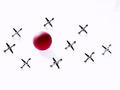
not jillsby magnetic9999Comment by Kavey: Nice idea and beautiful clean background. Layout of jacks doesn't feel right, somehow. 7, Kavey |
| 08/30/2002 09:19:00 PM |
not jillsby magnetic9999Comment by indigo997: Nice lighting. You came very close to completely eliminating the shadows which makes the whole scene seem like it's floating. Having them all on one plane and shooting from this angle adds to that effect. It's simple, clean, and high-key (the opposite of my submission this week). I like the subject, and it is technically very good. It would make a nice stock shot, but for some reason it doesn't have a lot of emotional pull for me. ~indigo997 |
| 08/30/2002 05:25:00 PM |
|
| 08/30/2002 01:19:00 PM |
not jillsby magnetic9999Comment by HBunch: This looks like it either had some upload problems, or it was post edited way too much. I am leaning towards post editing because there are shadows on some of them, but the shadows are washed out on the others. I know this is sometimes done to "erase" the background and if this were the case, you definately did a good job of erasing the background. There is a blemish of some sort up in t he upper right corner, but other than that, the angle is great and lighting is good. I like how there are no shadows on some of them, but i would like to have seen no shadows on all of them, but that would probably take a lot away from the photo. Good job and good luck in the challenge. |
| 08/30/2002 12:14:00 PM |
|
| 08/30/2002 07:42:00 AM |
not jillsby magnetic9999Comment by floyd: Lovely clean white background and still good light on the jacks and ball. Like it. 8 - floyd |
| 08/30/2002 02:07:00 AM |
not jillsby magnetic9999Comment by Gotcha: I like this. The white works well here. A couple of wrinkles in the cloth should be hidden. layout is good, color is good. But the jacks all seem to be facing in a uniform direction. I wonder if it would add a little pizzaz to random the positions a bit? - Good Luck, 8 (Gotcha) |
Home -
Challenges -
Community -
League -
Photos -
Cameras -
Lenses -
Learn -
Help -
Terms of Use -
Privacy -
Top ^
DPChallenge, and website content and design, Copyright © 2001-2026 Challenging Technologies, LLC.
All digital photo copyrights belong to the photographers and may not be used without permission.
Current Server Time: 07/19/2026 06:47:15 AM EDT.