| Image |
Comment |
| 05/31/2003 10:17:56 AM |
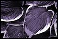
Moistureby magnetic9999Comment by wewillexplore: I like the toning of this shot - and the details are extremely crisp. The water seems naturally there, which is a bonus. The composition is nice to me - with two or three exceptions where it's just a black spot... |
 Photographer found comment helpful. Photographer found comment helpful. |
| 05/29/2003 03:19:13 PM |
|
| Photographer found comment helpful. |
| 05/29/2003 12:10:28 PM |
Moistureby magnetic9999Comment by dsidwell: Boy do these hostas change when put in duotone. It looks like you used a red filter, too, or possibly manipulated the red channel to get those dark tones in the leaves. I love this composition and the focus is magnificent! |
| Photographer found comment helpful. |
| 05/24/2003 11:17:15 PM |
|
| Photographer found comment helpful. |
| 05/23/2003 06:17:04 AM |
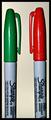
Face Offby magnetic9999Comment by marco: When I saw the title, I thought: 'Great! He or she switched the caps of the markers to make an allusion on the movie' ... and then I looked at the picture and I was a bit disappointed that I didn't find any reference of that idea. But.. it's a photography contest, and not a 'creative titling' contest, so I won't hold it against you, when scoring.
Technically speaking, I've got two remarks:
- the pens are not placed completely symmetrical. (Otherwise, if this was your intention, the difference between the two is not prominent enough.) It gives a kind of 'sloppy' impression.
- the background color doesn't match with the colors of the pens.
You've got good detail and sharpness, and the challenge is met very well (although not very creatively imho)
I hope that I not offended you with these comments. I honestly think you could do better than this. Regards, Marco. |
| Photographer found comment helpful. |
| 05/22/2003 10:32:05 PM |
Face Offby magnetic9999Comment by clues56: Good and simple, but the writing on the pens distracts a little. Very good color and sharpness |
| Photographer found comment helpful. |
| 05/22/2003 02:14:24 PM |
Face Offby magnetic9999Comment by qachyk: This would have worked better for me if staged with, say, multiple Sharpies of each colour, or perhaps against a backdrop of coloured-in squares on a whiteboard, or something along those lines. As it is, it sort of feels like you picked the first couple contrasting coloured objects you had handy, stuck them next to each other, and gave up. |
| Photographer found comment helpful. |
| 05/22/2003 09:08:09 AM |
Face Offby magnetic9999Comment by shadow: seems that flash was used for this shot. it shouldn't have been used. try using external light source. |
| Photographer found comment helpful. |
| 05/21/2003 01:54:03 PM |
Face Offby magnetic9999Comment by karmat: The tight crop helps to "build tension" I think a different color of background would have been more effective. |
| Photographer found comment helpful. |
| 05/20/2003 06:00:11 PM |
|
| Photographer found comment helpful. |
Home -
Challenges -
Community -
League -
Photos -
Cameras -
Lenses -
Learn -
Help -
Terms of Use -
Privacy -
Top ^
DPChallenge, and website content and design, Copyright © 2001-2026 Challenging Technologies, LLC.
All digital photo copyrights belong to the photographers and may not be used without permission.
Current Server Time: 04/07/2026 11:40:17 AM EDT.