Check-eredby
shaverComment by HBunch: *Critique Club*
Well, it looks like you received some very nice, very helpful comments after the challenge already. I didn't see the thread asking for opinions, so I don't know what other opinions you may have gotten there, so I'm not really sure what to add to that other than my personal opinions.
Per your request, here's your Critique Club comment...
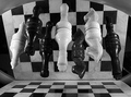
The image seems to me to be lacking contrast. It's quite grey. I'd like to see some brighter whites. You could play with the contrast and brightness a bit, this usually gets me to where I want. I tried it with this image briefly and it seemed to take away some of the detail in the black pieces. So maybe curves adjustments would work better?
The image to me seems a bit small. Try to take advantage of the full 640 pixel limit on photos. This will help us to better see what we're looking at and give us more of a sense of details.
Focus does seem a bit soft. I have photographed chess pieces and ran into the same problem. I got VERY few photos that actually came out looking generally focussed. Not sure how to clarify 'fixing' that problem, except to take lots and lots of pictures, playing with focal settings often and find out which works best for the situation you are working with.
The image also lacks lingering interest. The first reaction is 'oh neat' and then when you figure it out, there's nothing else to hold my interest in the photo.
Another minor picky detail is that the reflection seems to be reflecting back on the board creating black squares on some of the white squares. This breaks up the patterns a bit in my opinion by placing dark squares where white squares should be.
Overal a definately creative idea for the challenge, but lacking that special element that makes me say 'oh wow'.
~Heather~