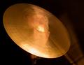
CymbalFaceby
nonniComment by CEJ: Hello from the Critique Club!
I have studied your image and have the following to offer:
Composition/perspective - The concept behind this shot is interesting and a good one, but the composition itself has some distractions: the bright flare on the cymbol obscures the eye of the subject. Not being visible takes strength away from the superimposition. There is an element in the background on the right - lower right to cymbol, that becomes a distraction since the reflection on the cymbol appears to follow it and it creates confusion as to what exactly it is a part of. Without looking closely for a length of time it appears as though there is something off to the right and there is bad light reflection. A closer look shows it appears to be a drumstick with motion blur. This ambiguity adds to the distractive element. The portion of chin/neck that falls below the cymbol also is somewhat of a distraction - it is separated from the rest of the subject by the flare on the cymbol at the point it falls off the cymbol. This leaves it somewhat detached from the rest of the imposed image and kind of hanging there. The focus on the cymbol is good and clear - the machining on the surface adds a nice element of texture.
Color - the color tones here are represented quite nicely. The cymbol as a canvas has a nice synergy with the skin tones of the superimposed face. It would be stronger if the background was all dark (see below) and there was nothing to compete with the color balance between them.
Lighting - the level of light is good. Overall not too bright to wash out the cymbol's texture, but not too dark to create dark lines on the ridges on the surface. There are two flares on the cymbol that because of their placement in relation to the subject matter are distracting. If the cymbol was against a completely dark background to isolate it this would add strength. The distraction to the right (object in background/drumstick) lightens up the one side taking the isolation aspect away.
Challenge requirements - at first glance it is hard to tell if this is one or two sources of light when looking at the cymbol (the flares). It takes a few seconds to reconcile the different planes of the two areas and conclude they are from the same source. In the end though, it meets the requirements.
Overall/my opinion - this could be a much stronger image if the distractions were not present and there wasn't so many elements that have to be figured out. I think this is where it may have fallen short in the challenge. Voters probably did not take the time to see everything present and appreciate the technical aspects. I think they were hit with the distractions and moved on. It is a fairly minimalistic image that gets a little 'busy' because of these distractions.