| Image |
Comment |
| 02/23/2006 08:16:05 PM |
|
| 02/23/2006 11:14:15 AM |
painterby Steveo77zComment by persimon: I think there is too much lint or dst on the surface. I wiped my own screen off, and this helped. I think the composition is strong. Just needs to be cleaned up a bit - and a bit more DOF might look better. |
| 02/22/2006 11:07:14 PM |
|
| 01/30/2006 03:48:25 PM |
|
| 01/29/2006 07:58:47 AM |
|
| 01/27/2006 03:45:43 PM |
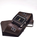
Watchby Steveo77zComment by Rikki: Nice image study perfect as an advert. I think it's a tad too tight at the bottom but aside from that, it'll make for a great print for a magazine. The DOF and focus is spot on. |
| 01/26/2006 11:00:02 PM |
|
| 01/26/2006 01:15:17 AM |
|
| 01/25/2006 01:01:58 PM |
Watchby Steveo77zComment by Dr.Confuser: Part of the fun of the challenge is comparing the photos to the work of the photographers they're paying tribute to. I can't figure out who that would be in this case. Composition feels a bit cramped on the bottom and the left. In contrast to the white background, richer tones in the strap would have improved my reaction to your photo. |
| 01/25/2006 04:25:59 AM |
Watchby Steveo77zComment by h2: better WATCH your crop (at bottom and left). good detail and DOF |
Home -
Challenges -
Community -
League -
Photos -
Cameras -
Lenses -
Learn -
Help -
Terms of Use -
Privacy -
Top ^
DPChallenge, and website content and design, Copyright © 2001-2026 Challenging Technologies, LLC.
All digital photo copyrights belong to the photographers and may not be used without permission.
Current Server Time: 07/15/2026 04:18:16 PM EDT.