DPChallenge: A Digital Photography Contest You are not logged in. (log in or register
 
Browse Settings
Currently viewing:
Registered UserNekoNita

Show comments:

Per page:

Order:

Comments:


Comments Received by NekoNita
Pages:  
Showing 21 - 30 of ~68
Image Comment
The Kiss
12/06/2005 12:14:37 AM
The Kiss
by NekoNita

Comment by echo54:
neat
Poker Sweetheart
12/02/2005 05:40:35 AM
Poker Sweetheart
by NekoNita

Comment by LalliSig:
Greetings from the critique club.

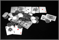
I haven´t seen this image before, didn´t vote but I probably would have given this a 4 to be honest. Technically it´s not bad but hardly good either. The lighting is a bit flat and the bland black backround isn´t helping, I personally would have liked this shot heaps more if the backround had some texture, like a wooden table or something like that. I notice you used an extremely small aperture for this shot and a long shutter speed. The shutter speed is pretty much irrelevant since the subject isn´t moving but I don´t really understand the aperture. Was it really neccesary to have everything inside the DOF? I seriously doubt it so I would suggest you keep to f5.6-11 to make the most out of the sharpness of your lens, at small apertures the lens starts to suffer sharpness due to diffraction and I think it shows in the shot. As a matter of fact, did you sharpen after resizing it, the shot looks a little bit too soft.

On the good side, the composition is decent, not really an interesting angle but nothing bad about it at all. The shot is pretty well exposed, seem to have a few blown out highlights though so softer lighting would be a key to reduce that. Also the shot is in focus, no question although I personally would have used a bigger aperture.

Certainly meets the challenge but you really have to keep in mind that most people just look at the image for a second and then go on to the next one and you really have to look for all five aces. I would suggest keeping it more simple next time, like having a hand hold all fice aces so that the point comes across right away, it should lead to a better rating.

Hope I wasn´t too negative, I wouldn´t give you such a hard time if I didn´t see potential so keep it up :D

Kind regards, Larus.

Photographer found comment helpful.
Transparent Building
11/29/2005 11:47:55 PM
Transparent Building
by NekoNita

Comment by livitup:
I wouldn't worry too much about your place... this was a rather high scoring challenge overall. A 4.6 isn't bad at all for a first entry. It takes a little while to figure out what works here.

I think it's a good picture. Not great, definatley not horrible.

My argument for getting rid of the motion blur, either with a crop, or with faster shutter speed, is that it detracts from the point of the photo, which is the transparency of the first building. You don't want people being distracted by the cars. If you had cropped that out then you could have metered the exposure for the building and lightened the whole thing up a little bit.

Just my $.02 :)
Poker Sweetheart
11/27/2005 07:48:47 PM
The Wedding
11/24/2005 10:26:40 AM
The Wedding
by NekoNita

Comment by eschelar:
This is excellent. If I was doing the voting, this would have been a lot higher up than middle of the pack. I feel the story and emotion ascribed to the inanimate chess peices is superb.

Well done.

Fave.
Poker Sweetheart
11/23/2005 05:52:25 PM
Poker Sweetheart
by NekoNita

Comment by tpoc:
nice star effect on the watch. like the composition and selective desaturation. the top left card appears to be a bit muddied....like it's not bright enough or not in enough shadow. i like the composition.
Photographer found comment helpful.
The Wedding
11/21/2005 09:26:13 PM
The Wedding
by NekoNita

Comment by NekoNita:
Did update my portfolio to put the individual images used for the triptych

The Wedding
11/21/2005 10:42:48 AM
The Wedding
by NekoNita

Comment by NekoNita:
Thanks all for your votes/comments.
Regarding the details I recon that reduced this way they are not really viewable but I can ensure they are there.
In fact I spent a lot of time on the post treatment and when I found something I was pretty happy with I didn't have anything left to change the little details that were worrying me like the part too dark on the right or too light on the left.
My initial idea was really to oppose 2 families that would merge in the central picture. I appreciate the comment that made the reference to Shakespeare ;)
The Wedding
11/20/2005 09:02:20 PM
The Wedding
by NekoNita

Comment by Marc923:
I like the colors and set up you have here. Job well done.
Photographer found comment helpful.
The Wedding
11/20/2005 11:30:15 AM
The Wedding
by NekoNita

Comment by Car54:
Interesting, but I wander why the 3rd pane is gray tone
Photographer found comment helpful.
Pages:  
Showing 21 - 30 of ~68


Home - Challenges - Community - League - Photos - Cameras - Lenses - Learn - Help - Terms of Use - Privacy - Top ^
DPChallenge, and website content and design, Copyright © 2001-2025 Challenging Technologies, LLC.
All digital photo copyrights belong to the photographers and may not be used without permission.
Current Server Time: 08/02/2025 02:02:49 AM EDT.