Cactusby
BrielleComment by kteach: Greetings from the Critique Club!
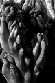
My first reaction to this shot was to question which challenge it came from. High contrast? Abstract macro? I think in either of those challenges it might have scored a little higher, but in the free study it just didn't speak to the voters as much on it's own.
The lighting here is great (as you noted), I love the contrast it provides. I like the prickly textures contrasted with the smoothness of the plant too. But, my eye just wanders around aimlessly giving me nothing to focus on, so I end up looking at the large dark area. Perhaps a different crop or angle would have given a composition that let the viewer's eye wander around looking at the great lighting and textures more systematically.
Most of the commenters said that they liked the b/w conversion, but I'm wondering what the color version would have looked like, or even just a slightly desaturated version. Could you play with the hue a bit if you weren't fond of it?
Overall, I think for me this picture just doesn't tell me much of a story. It has some interesting technicals and details, but the composition doesn't allow the viewer to just enjoy them without hitting those awkward parts of the picture.
I hope this critique was helpful. Please feel free to PM me if you have any questions!