| Image |
Comment |
| 12/13/2005 04:27:49 PM |
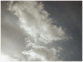
Too Early for Rainby sarnComment by edekker: Nice. But the composition does little. My eyes are looking at some clouds. But the effect that it is about to rain is not very much there. |
| 12/12/2005 12:24:29 PM |
Too Early for Rainby sarnComment by melismatica: I think the title is stretching it a bit. This is a decent capture of clouds which aren't an easy subject. I would like to see a bit more detail in the shadow areas of the clouds and I'm not woed by this composition--the clouds just aren't quite dramatic enough to carry the compositional weight of the photo. |
| 12/11/2005 09:48:55 AM |
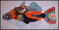
CD fishby sarnComment by CEJ: This image was disqualified from the challenge. Due to the nature of the disqualification, I am not going to perform the critique of this image. Message edited by HBunch - Removed Critique Club status. |
| 12/09/2005 05:00:16 AM |
|
| 12/07/2005 06:33:54 PM |
Too Early for Rainby sarnComment by rick13601: They are clouds, simply clouds! The pic relies too much on the title to understand how this meets the challenge. IMO |
| 12/07/2005 02:49:17 PM |
|
| 12/07/2005 01:44:49 PM |
|
| 12/07/2005 06:46:13 AM |
|
| 12/07/2005 04:24:25 AM |
|
| 12/04/2005 02:44:39 PM |
CD fishby sarnComment by Prism: love the concept. The colours may have popped better if you had used a black background. As it is, the white labels and the blue labels tend to blend more into the background and not give it as much definition as it could otherwise have. |
 Photographer found comment helpful. Photographer found comment helpful. |
Home -
Challenges -
Community -
League -
Photos -
Cameras -
Lenses -
Learn -
Help -
Terms of Use -
Privacy -
Top ^
DPChallenge, and website content and design, Copyright © 2001-2026 Challenging Technologies, LLC.
All digital photo copyrights belong to the photographers and may not be used without permission.
Current Server Time: 07/02/2026 07:18:24 AM EDT.