| Image |
Comment |
| 02/27/2006 09:48:50 PM |
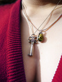
Key to Her Heartby vergComment by Neil: Greetings from the critique club.
This was a good idea for the challenge. The colors and focus are good.
You've already received some good constructive comments about issues of lighting and setup. I agree with these. As for my helping comments, I'll focus on composition. I find the composition of this is interesting, but distracting. The position of the dress on her (seems uneven on her neck and breasts) with this crop adds confusion to her form. There's no sense of balance of objects in the composition, no salient geometric design. More towards chaos--perhaps that was intentional, as the two necklaces do add to that feeling. But while romance often leads to chaos, I'm not sure the opposite is true, and to me the photo doesn't really tell the same story as the title.
My thought when seeing this as to a derivative approach (perhaps using an outtake or a reshoot): why not crop her neck out, and use the dress and neckline to catch the abstraction of a heart. Center the key in it, and use the cleavage for "context".
Hope that helps. Regards--Neil
|
 Photographer found comment helpful. Photographer found comment helpful. |
| 02/21/2006 11:47:45 AM |
|
| 02/21/2006 09:43:48 AM |
Key to Her Heartby vergComment by UNCLEBRO: maybe if the other necklace had been taken off, then the key would have stood out more?
good attempt though.
and good luck. |
| Photographer found comment helpful. |
| 02/16/2006 09:51:38 AM |
Key to Her Heartby vergComment by persimon: I think the composition is great. The lighting seems to be a bit to bright in the skin on the left side of the frame. I love the shadow in the plunging neckline. |
| Photographer found comment helpful. |
| 02/15/2006 12:59:33 AM |
Key to Her Heartby vergComment by fotomann_forever: 9 ... more cleavage and ya'd got a ten ... lol... just kidding ofcourse
only real problem I have is the overexposed portion of the breast, you've lost some skin detail that could have made this shot really stand out |
| Photographer found comment helpful. |
| 02/12/2006 07:19:19 PM |
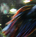
Tropical Light Flakesby vergComment by liebe: It looks like a bit overexposed and a bit noisy. I like the flow of the lines, but it is just not sharp enough. |
| Photographer found comment helpful. |
| 02/12/2006 06:30:59 AM |
|
| Photographer found comment helpful. |
| 02/12/2006 03:59:31 AM |
|
| 02/09/2006 06:31:58 PM |
Pieces of Meby vergComment by posthumous: great use of stairs to create a dynamic shadow that interacts with all the stair shadows. 7. |
| Photographer found comment helpful. |
| 02/09/2006 12:36:24 PM |
Tropical Light Flakesby vergComment by Melethia: Kind of looks like the inside of a car wash place. Overall, though it's lacking in any feel of "depth" and the bright spots don't add to the picture, in my opinion. |
| Photographer found comment helpful. |
Home -
Challenges -
Community -
League -
Photos -
Cameras -
Lenses -
Learn -
Help -
Terms of Use -
Privacy -
Top ^
DPChallenge, and website content and design, Copyright © 2001-2026 Challenging Technologies, LLC.
All digital photo copyrights belong to the photographers and may not be used without permission.
Current Server Time: 07/16/2026 12:11:24 AM EDT.