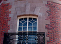
DPChallenge: A Digital Photography Contest You are not logged in. (log in or register
 
Browse Settings
Currently viewing:
Registered Userlinda12201

Show comments:

Per page:

Order:

Comments:


Comments Received by linda12201
Pages:   ... ...
Showing 81 - 90 of ~244
Image Comment
Giant Icicle
03/28/2006 06:33:46 AM
Giant Icicle
by linda12201

Comment by mosall:
Wow, thats amazing.
Photographer found comment helpful.
Giant Icicle
03/27/2006 04:08:46 PM
Giant Icicle
by linda12201

Comment by kim5814:
Would have been better if you could have gotten an unobstructed view.
Photographer found comment helpful.
Giant Icicle
03/27/2006 01:25:24 AM
Giant Icicle
by linda12201

Comment by seebrown:
very very strange ... might have been better to get a closer shot
Photographer found comment helpful.
Giant Icicle
03/27/2006 01:16:34 AM
Giant Icicle
by linda12201

Comment by Bear_Music:
That's a bizarre scene. I presume it's a frozen geyser?
Photographer found comment helpful.
The Window
03/25/2006 01:43:17 AM
The Window
by linda12201

Comment by kari1:
::: Critique Club :::

Hi, my name is Kari and from the critique club.

Interesting to do a critique on your image but it is difficult if you don't give us any information in your photographers comments. When we do a critique, we go past just the photographic result, that's what voters comments do. The critique looks at what you were trying to achieve, how you wanted it to look and what issues you had in getting the image captured and ready for voting.

First Impression - the most important one:
Interesting .. but missing something ... the crop is a little strange.

Composition:
This is where i think you have issues ... the balcolny is almost straight - but not quite ... because of the angle of the shot the eye is a little confused.

I think that with a balcony shot like this it would have been good to include the bottom or at least a little more of the balcony. but another option would be a right crop of the balcony and grey bricks ... this gives a good focus area .. and really pops the image.

Subject:
I am not sure of what the literary reference is .. but I sure it meets the challenge.

Technical (Colour and light):
Playing with brightness or light in the post processing may have helped - but the focus is a little off ...

To grow its vote?:
Try again with the cropping ... and play with the contrast and brightness .. these are things I tend to use ... and they seem to work.

Summary:
Not your best scoring and through a little more post processing may have been better ... but you did good .. keep it up.

If you've got any questions about this critique, please feel free to contact me via the PM system.

Cheers

Kari
Photographer found comment helpful.
Mother and Son copy.jpg
03/24/2006 08:53:43 AM
Mother and Son copy.jpg
by linda12201

Comment by linda12201:
I am not really sure about the color. My husband thinks it might buckskin.
Mother and Son copy.jpg
03/24/2006 06:10:32 AM
Photographer found comment helpful.
Mother and Son copy.jpg
03/24/2006 01:15:47 AM
Mother and Son copy.jpg
by linda12201

Comment by Jutilda:
SWEET!!! I like the composition of this shot. I might have more negative space in front of the hooves. What do you call his coloring?
Photographer found comment helpful.
The Window
03/18/2006 04:40:35 PM
The Window
by linda12201

Comment by Nyck:
mmm culd be in focus more,but everything else is gr8!the curve brings it alive!
Photographer found comment helpful.
First Cowboy Boots
03/18/2006 01:51:37 PM
First Cowboy Boots
by linda12201

Comment by KarenNfld:
Very nice
Photographer found comment helpful.
Pages:   ... ...
Showing 81 - 90 of ~244


Home - Challenges - Community - League - Photos - Cameras - Lenses - Learn - Help - Terms of Use - Privacy - Top ^
DPChallenge, and website content and design, Copyright © 2001-2025 Challenging Technologies, LLC.
All digital photo copyrights belong to the photographers and may not be used without permission.
Current Server Time: 08/24/2025 10:45:36 AM EDT.