DPChallenge: A Digital Photography Contest You are not logged in. (log in or register
 
Browse Settings
Currently viewing:
Registered Userlinda12201

Show comments:

Per page:

Order:

Comments:


Comments Received by linda12201
Pages:   ... ...
Showing 181 - 190 of ~244
Image Comment
Cover Page
12/13/2005 11:34:09 PM
Cover Page
by linda12201

Comment by backslash:
Cluttered composition and over exposed slightly.
Candlelit Christmas Card
12/13/2005 11:31:13 PM
Candlelit Christmas Card
by linda12201

Comment by vikas:
The setup was nice and had a potential of being a great shot.

It seems you have used an on camera flash or some other external light that is creating the hotspots on the decorations, also while it helps capture the flame of the candle its killing the dramatic effect that would have been created if the shot was lit just with the candles.
Photographer found comment helpful.
Cover Page
12/13/2005 10:11:40 PM
Cover Page
by linda12201

Comment by SarahCJ:
Great twist on the challenge, just fits. I would love to see it on the cover of a toys catalog.

Nice setup there.

<3 Sarah
Candlelit Christmas Card
12/13/2005 11:03:11 AM
Candlelit Christmas Card
by linda12201

Comment by CNovack:
The only thing lacking in this festive holiday card photo are those nice warm tones that are cast on the whole scene by the glow of the candlelights. The lighting here is a full on white light either from daylight lighting the scene or by indoor lighting. There are none of those nice warm orange/yellow tones that bath the scene in a warm and inviting light. It is that type of light (candlelight) that could help the scene become more warm in mood and feeling.
Photographer found comment helpful.
Candlelit Christmas Card
12/12/2005 10:01:20 PM
Candlelit Christmas Card
by linda12201

Comment by Katmystiry:
I see the candlelight but there seems to be another much brighter light source. Nice setup.
Photographer found comment helpful.
Cover Page
12/12/2005 06:54:05 PM
Cover Page
by linda12201

Comment by debitipton:
Really busy for my tastes. It's almost like on of those Eye Spy books.
Cover Page
12/12/2005 12:55:36 AM
Cover Page
by linda12201

Comment by NstiG8tr:
Merry X-mas from me 10
Silcion Mountain
12/09/2005 06:01:04 PM
Silcion Mountain
by linda12201

Comment by CEJ:
Hello from the Critique Club!

I have studied your image and have the following to offer:
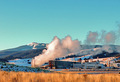
Composition/perspective Γ’€“ I think your distance to your subject is pretty good, but there is too much image to support it nicely. Being so far away you lose a lot of the structure detail, but you gain the nice view. Perhaps cropping off the left side of the image and maybe a little off the top before resizing would allow an overall larger image (closer to 640x640). On the right side of the image the buildings are cut off. However, there seems to be a break between the buildings just in front of the white stack. Cropping between the buildings would allow the one to be complete while eliminating the one that isnΓ’€™t. I am not sure about the grass in the foreground. Perhaps if sharpened a bit more to show more of the detail would help it as an element of the shot. But as is it just seems to take up the bottom of the picture with no real purpose. It is not necessary to show your distance. The focus front to back in the image is done well. But again, a little sharpening would help to define the details of the building.

Color Γ’€“ the colors are very vibrant in this image. But some of the white areas look artificially blue (to the left of the steam, on the hill in the background to the right. Perhaps it is just the way the sun is hitting the snow near those areas making the shadows look that way. The saturation might be a little high Γ’€“ the red staircase for example.

Lighting Γ’€“ natural light, most of the image appears to be in the same light with some areas in shadow. The steam has a large bright spot on it I find a little distracting. The detail though is still present in most of the image Γ’€“ the trees on the hills. Some detail is lost though in the confusion just in front of the plant.

Challenge requirements Γ’€“ for industrial it meets the challenge requirements well.

Overall/my opinion Γ’€“ as stated above I think a different crop may make this a stronger image as well as some sharpening. A pet peeve of mine, but may have hurt you some with the voters Γ’€“ the spelling error in your title. Gives the impression you donΓ’€™t really care enough about your image to spell the title correctly.


Message edited by HBunch - Fixing CC glitch.
Silcion Mountain
12/09/2005 05:59:18 PM
Silcion Mountain
by linda12201

Comment by CEJ:


Message edited by HBunch - fixing cc glitch.
Silcion Mountain
12/02/2005 11:09:05 AM
Silcion Mountain
by linda12201

Comment by swankFoto:
Too noisy and oversaturated for me.
Photographer found comment helpful.
Pages:   ... ...
Showing 181 - 190 of ~244


Home - Challenges - Community - League - Photos - Cameras - Lenses - Learn - Help - Terms of Use - Privacy - Top ^
DPChallenge, and website content and design, Copyright © 2001-2025 Challenging Technologies, LLC.
All digital photo copyrights belong to the photographers and may not be used without permission.
Current Server Time: 08/24/2025 10:44:51 AM EDT.