| Image |
Comment |
| 01/11/2006 12:43:54 PM |
|
 Photographer found comment helpful. Photographer found comment helpful. |
| 01/09/2006 07:41:14 PM |
|
| Photographer found comment helpful. |
| 01/09/2006 03:02:01 PM |
|
| Photographer found comment helpful. |
| 01/08/2006 06:45:22 PM |
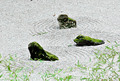
Zen Gardenby talmyComment by I Enjoy Ham: Hi from the critique club :)
At first when i saw this image i thought that the greens were very blown out and that the pattern did not seem like the main point of this picture. Upon further inspection my initial feelings were correct for this image.
Although the green moss and the bamboo leaves (I believe thats what they are) add to the photo nicely, when you increase the saturation of a certain color too much it becomes to look too saturated, and thus attains a fake look. Also another thing to realize is that when you reduce a color from a photograph (in this case yellow) you a re decreasing the color from the whole photo not just the part you want to unless your using selective desaturation. I say this because it is a common mistake not to realize where certain colors are and how they affect the picture. Before i do any desaturation of colors i bring the saturation of that color all of the way up just so I can see where that color is located and what areas it will affect when i do the desaturation. I think this affected the photo for me because of the pebbles seeming almost a non-real color. Also the bamboo leaves have yellow in them too and the desaturation affected them aswell.
As i said before in this photo the pattern in the pebbles does not seem like the main point in this picture. When i see this picture i see the rocks as the main focus. I think that this is also one of the reasons why this photo got voted down.
This critique is not meant to discourage you in any way, and keep up the good work. If you have any questions or comments don't hesitate to contact me via e-mail or private messaging.
-Dan Gruskin |
| Photographer found comment helpful. |
| 01/07/2006 12:34:48 PM |
Bulbby talmyComment by peanutbutterguitar: Focus doesn't seem to be as sharp as it could be, perhaps better lighting required. I love the concept and the shapes. |
| Photographer found comment helpful. |
| 01/07/2006 01:55:39 AM |
|
| Photographer found comment helpful. |
| 01/05/2006 12:19:38 PM |
|
| Photographer found comment helpful. |
| 01/05/2006 10:22:07 AM |
Bulbby talmyComment by ginjer: Interesting idea. The composition is okay, but I would likk to see the glass bulb more clearly, perhaps with less reflection from all the overhead lighting. |
| Photographer found comment helpful. |
| 01/05/2006 10:09:13 AM |
Bulbby talmyComment by olbol: What a pleasant photo, but what an illogical addition of the lightbulb! |
| Photographer found comment helpful. |
| 01/05/2006 02:32:45 AM |
|
| Photographer found comment helpful. |
Home -
Challenges -
Community -
League -
Photos -
Cameras -
Lenses -
Learn -
Help -
Terms of Use -
Privacy -
Top ^
DPChallenge, and website content and design, Copyright © 2001-2026 Challenging Technologies, LLC.
All digital photo copyrights belong to the photographers and may not be used without permission.
Current Server Time: 07/26/2026 07:59:56 PM EDT.