| Image |
Comment |
| 04/08/2003 02:58:47 PM |
|
| 04/08/2003 11:43:43 AM |
Coloursby bcncrazyComment by basia03: there is a lot of noise on your red background... Message edited by author 2003-04-14 10:30:43. |
| 04/08/2003 05:42:21 AM |
Coloursby bcncrazyComment by Silver Fox: lots and lots of different colors to choose from. and all lines up so prettily. certainly meets the challenge, doesn't it? focus is good. lighting is fine. of course, the color has to be good with so many colored pencils. your photo shows some good thought process and imagination and the choice of these colored pencils are rich and vibrant in color. |
 Photographer found comment helpful. Photographer found comment helpful. |
| 04/08/2003 02:41:20 AM |
Coloursby bcncrazyComment by starblazer: Why an orange background? I think a white or black background would bring out the colours of the pencilcrayons better. |
| Photographer found comment helpful. |
| 04/07/2003 12:52:39 PM |
|
| 04/07/2003 12:14:16 PM |
|
| Photographer found comment helpful. |
| 04/07/2003 06:15:33 AM |
|
| 04/07/2003 04:03:14 AM |
Coloursby bcncrazyComment by deadbrain: Why did you choose the orange background? The normal choise would have been a neutral background color.
The shadows this way are colored too. Is it a choise? |
| Photographer found comment helpful. |
| 03/27/2003 07:59:59 PM |
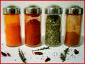
Kitchen Artby bcncrazyComment by jmsetzler: Greetings from the Critique Club :)
Hi Bncrazy...
I really like this composition... Spices.. vibrant color... some amount of randomness to the environment... I can 'smell' what I see in this photo.
The lighting on this photo is pretty good. I don't think you could improve it very much, but possibly just a little longer exposure would saturate the white area just a tiny bit more. I believe this would punch up the visual impact just a bit. I wouldn't want the surroundings completely white at all, but just a tad brighter would suit my taste a little better overall.
Another idea that could possibly create a nice composition here would be to put one of the two center bottles on its side with the lid off and let some of the contents spill into the foreground. This would help upset the balance a little more and it would also give a good strong focal point in the image. As this image is presented, it has multiple subjects and doesn't really have a single strong resting place for the eye.
Keep up the good work :)
John Setzler
|
| 03/23/2003 02:12:28 PM |
Kitchen Artby bcncrazyComment by alanfreed: Excellent colors and details! I would have bumped this up by a point if the foreground had been in perfect focus. |
| Photographer found comment helpful. |
Home -
Challenges -
Community -
League -
Photos -
Cameras -
Lenses -
Learn -
Help -
Terms of Use -
Privacy -
Top ^
DPChallenge, and website content and design, Copyright © 2001-2026 Challenging Technologies, LLC.
All digital photo copyrights belong to the photographers and may not be used without permission.
Current Server Time: 07/16/2026 02:56:40 AM EDT.