| Image |
Comment |
| 04/28/2005 08:43:39 AM |
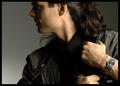
OUTBACKby DrJOnesComment by fplouffe: Excellent composition and ligthing. Shadows on model and good lighting of the watch makes this picture work. |
 Photographer found comment helpful. Photographer found comment helpful. |
| 04/28/2005 01:14:26 AM |
OUTBACKby DrJOnesComment by Dr.Confuser: Outstanding photo. Well composed, captured and executed. Unique in a very positive way. Understated focus on the watch is dynamite. Text on wrist and below watch fits perfectly. If this doesn't ribbon, I'll be well and truly disappointed in DPC voters. |
| Photographer found comment helpful. |
| 04/27/2005 10:28:08 PM |
OUTBACKby DrJOnesComment by Judith Polakoff: Not sure if I'm rating your model a 10 or the watch. lol But seriously, a lovely shot and effective advertisement. 10 |
| Photographer found comment helpful. |
| 04/27/2005 03:18:38 PM |
OUTBACKby DrJOnesComment by neophyte: Not as original as some of the others but well composed and shot. More emphasis on the product is needed, (if you had to put the brand name on his hand like that, you probably already knew the watch needed to be better featured.) Negative space is excellent and would allow easy text expansion. The text you placed is well done (except for the hand) but would need more contrast to stand out more. |
| 04/27/2005 01:23:38 PM |
OUTBACKby DrJOnesComment by nico_blue: excellent photo in any other challenge i would have given you a 9 or 10... but for this challenge i would have liked a closer crop of just the hands and watch. my suggestion would have been just above the shoulder as the top edge and just left of the lower hand as the left edge. 8 |
| Photographer found comment helpful. |
| 04/27/2005 11:33:08 AM |
OUTBACKby DrJOnesComment by roonie: This photo is good enough for a magazine. I love the layout. I gave it a 10. |
| Photographer found comment helpful. |
| 04/27/2005 10:10:02 AM |
OUTBACKby DrJOnesComment by dsidwell: Dark face makes attn go to watch and OUTBACK word mark. So nice work! Advertising done effectively. 10 |
| Photographer found comment helpful. |
| 04/26/2005 10:01:34 PM |
|
| Photographer found comment helpful. |
| 04/26/2005 07:47:22 PM |
OUTBACKby DrJOnesComment by justinbrook: This is good. I could imagine turning a mag page and seeing this. Good posture, looks like hes going somewhere. Nice choice of font and text. Very minimal is very effective. This is in my top ten. Good Job |
| Photographer found comment helpful. |
| 04/26/2005 05:42:44 PM |
OUTBACKby DrJOnesComment by Joey Lawrence: Very clever use of text!
The bright hand leads your eye into where the person should be looking, great work man. |
| Photographer found comment helpful. |
Home -
Challenges -
Community -
League -
Photos -
Cameras -
Lenses -
Learn -
Help -
Terms of Use -
Privacy -
Top ^
DPChallenge, and website content and design, Copyright © 2001-2026 Challenging Technologies, LLC.
All digital photo copyrights belong to the photographers and may not be used without permission.
Current Server Time: 07/18/2026 06:02:07 PM EDT.