Light my fire!by
GiorgioComment by CEJ: Hello from the Critique Club!
I have studied your image and have the following to offer:
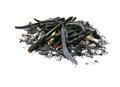
Composition/perspective - your subject to negative ratio in this shot is good. The problem is that it is very centered in the shot. Application of the rule of thirds would have helped this in that area. Being a low camera angle to the subject is a good technique applied well here. Your focus is sharp and the amount of detail is real nice.
Color - the white certainly is white. No disruptions in that. Nice choice of backgrounds/processing to keep it clean looking without any reflections or flares/glares. It is not blown out either. The subject matter shows a nice tonal range through the grays to black. This may be part of why the image fell short in the challenge (see below).
Lighting - very well done! No harsh shadows, no blown out areas and no sharp reflections. The detail in the subject is very nicely shown which I attribute to the lighting.
Challenge requirements - this is where this image fell short in the voting I think. The challenge was
light on white. Your subject is anything but light. The main elements are black. If there was more ash or just ash this would have helped. But the black pieces take it out of the acceptable zone.
Overall/my opinion - in another challenge, with application of the rule of thirds, this would have been a strong entyr. Your command of the camera is clearly shown here. I like the image and think it is a good image. Just not for this challenge.