Huevosby
RfariasComment by jimmythefish: Critique Club Critique
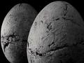
This photograph is all about texture. The black and white is a good choice in this regard, I think. It draws you to the tactile nature of the objects. The tonal range produced by the light over the rough edges is much more interesting to look at than one over smooth edges.
Compositionally this works. The close crop is a good sacrifice, in that we're exploring texture rather than the space occupied by the eggs. Wasting space on a background would be ill-advised given the format. The lower-right hand corner satisfies the needs for dark space. My eyes are naturally drawn to the lit left edges of the eggs and then fade over to the right side and into darkness. The choice of including two eggs is also a good one, as there's a definite relationship between the eggs. The depth allows you to show the shape of one and the texture of the other.
Technically I think this could be improved slightly. There seem to be compression artifacts in the eggs, especially in the areas of a more even tone, which causes the true texture to suffer. The tonal separation seems to be a bit harsh, though there are no hotspots and the contrast is good. It might also be oversharpened a bit - the edges of the eggs at the top hint at this. However, it's hard to tell given the nature of the surface.
Overall I think this photograph is a success. I enjoy looking at it and wonder about the story behind the eggs. Ultimately a good photograph can take even the most mundane objects and make them interesting and beautiful to look at. Though these might not be mundane, it is certainly a good representation.
James Davison
jimmythefish