| Image |
Comment |
| 03/03/2003 01:03:20 PM |
[TITLE] hereby rj324Comment by jmsetzler: this is a strong leading line... if the cars in the distance are your subjec, the line may be overpowering that subject and becoming the subject itself :) - setzler |
 Photographer found comment helpful. Photographer found comment helpful. |
| 03/03/2003 11:47:18 AM |
Sevenby rj324Comment by dsidwell: Yep. 7 eggs. Good arrangement and cropping. Try fiddling with the angle of the light source to create more interesting shadows. |
| Photographer found comment helpful. |
| 03/03/2003 09:46:19 AM |
[TITLE] hereby rj324Comment by Sonifo: This is definitly leading lines, but maybe if you had your subject a bit closer so we could see more detail. |
| Photographer found comment helpful. |
| 03/03/2003 09:21:29 AM |
|
| Photographer found comment helpful. |
| 03/01/2003 05:37:46 PM |
|
| Photographer found comment helpful. |
| 02/28/2003 04:02:50 PM |
|
| Photographer found comment helpful. |
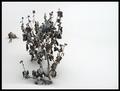
| 02/28/2003 01:18:43 AM |
Snow Fall Rhythm on Dead Flowerby rj324Comment by sulamk: Greetings from the Critique Club
Composition
I love the way this is framed and feel that there is a definite rhythm to the way the snow is falling.
Sharpness: The soft focus adds to this image it doesn't detract from it in my opinion
Exposure:
Contrast & Color: A little bit grey.
Suggestions for improvement:
Next time up the ev a stop and try iso 200. |
| 02/27/2003 09:23:36 AM |
|
| Photographer found comment helpful. |
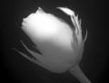
| 02/27/2003 08:29:26 AM |
This one for you!by rj324Comment by indigo997: Well... That's a different take on love.
Red roses might say love, but this is a bit of a stretch for me.
I like the angle of the flower, and the close-up. It might work as a square crop. Something about the horizontal orientation just doesn't seem right to me. I don't really think you needed water drops in this one. They don't add much IMO, and the light reflections on them look a little like hot pixels. The focus is good except for that one leaf - maybe it you turned the flower some so that it isn't coming forward so much. It wouldn't really bother me if there were other parts that were out of focus but having just that one area blurred sort of makes it pop out too much. I like the lighting on top and the shadow on the petals from the leaf. I'd like a little more light on the bottom and stem though because there just isn't enough detail/contrast there. The area in the middle of the petals - between the bright spot and the darker areas - is the best because you can see all of the detail.
It's really a cool shot though maybe not the best for this challenge. High quality with just a few nit-picky technical quirks. It's probably can't appreciate a lack of color at all. |
| 02/26/2003 09:08:53 PM |
|
Home -
Challenges -
Community -
League -
Photos -
Cameras -
Lenses -
Learn -
Help -
Terms of Use -
Privacy -
Top ^
DPChallenge, and website content and design, Copyright © 2001-2026 Challenging Technologies, LLC.
All digital photo copyrights belong to the photographers and may not be used without permission.
Current Server Time: 07/16/2026 11:56:56 AM EDT.


![[TITLE] here](https://images.dpchallenge.com/images_challenge/0-999/71/120/Copyrighted_Image_Reuse_Prohibited_13440.jpg)