| Image |
Comment |
| 07/14/2003 09:08:07 AM |
|
 Photographer found comment helpful. Photographer found comment helpful. |
| 07/14/2003 06:22:57 AM |
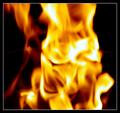
Hot Flameby rj324Comment by SharQ: Hot indeed. I realise the out-of-focusness was probably on purpose, but (as a pyrotechnician) I know how beautiful flames are when they are in pin-sharp focus, and this doesn't really work in comparison. |
| Photographer found comment helpful. |
| 07/14/2003 12:39:01 AM |
|
| Photographer found comment helpful. |
| 06/26/2003 10:07:26 PM |
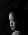
Siamese IIby rj324Comment by mci: slightly soft on the focus. i think a sharper focus would work better. also a tad grainy, but i think that works fine. the light is a bit flat, but you've got good catch lights in the eys and a nice reflection on the lips. overall a nice image. 6. |
| Photographer found comment helpful. |
| 06/26/2003 11:20:09 AM |
Siamese IIby rj324Comment by dsidwell: I like the direction from which the light is coming. The low key effect, combined with her expression, create a sense of mystery and exotic-ness. |
| Photographer found comment helpful. |
| 06/25/2003 10:44:41 PM |
Siameseby rj324Comment by wewillexplore: I disagree with a good many of your commenters. When I hear Siamese, I think "twins" - I think the black space indicates where her twin is missing (or I'm completely wrong, they are completely right and you left too much black space).
I love this shot. I lived in Asia and I think she has a respectful paying attention look on, not one of disinterest.
Excellent shot.
M |
| Photographer found comment helpful. |
| 06/25/2003 08:20:47 PM |
Siamese IIby rj324Comment by adine: A dramatic portrait. I wish it extended down more - so we could see the entire neckline of her dress. Wish also that the background were completely black - at least air=brush out the wrinkles. |
| Photographer found comment helpful. |
| 06/25/2003 07:48:10 PM |
|
| Photographer found comment helpful. |
| 06/23/2003 11:22:33 PM |
|
| Photographer found comment helpful. |
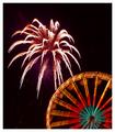
| 06/23/2003 09:23:49 PM |
Highlights for Children - 4th of July Issueby rj324Comment by CLarson557: Hi Ray,
Greeting from the Critique Club:
I think I've done a critique on one of your photos before. I still enjoy seeing your work. For the current photo, I'm very impressed...especially since you didn't use a tripod for this.
Composition: It really is a pretty photo. Although it would have been nice to see a more colorful firework, I still think that the colors are nice. I also like the red streaks that turned out looking like curled ribbon confetti. They showed up nicely. The photo is well framed. The huge firework above the ferris wheel located in the bottom corner of the photo works well.
Technical: Well done for a night time firework shot. I'm still quite impressed of the quality you did get given that it was taken without a tripod. It really would have been better, though, with one. You can tell there was shakiness by looking at the ferris wheel. It really isn't as sharp as it could have been. The firework burst does look good.
Challenge: This is probably the area that hurt you in the scoring, especially with those that take the name of the challenge seriously. Highlights has never used photographic images for their covers. Almost any other magazine would have been fitting for this photo.
Overall: The photo itself is nice...probably deserving a higher score than what you got. I really do belive that the choice of magazine is what hurt you most of all. Perhaps just a little better clarity would have put you closer to the 6 point range if not higher. I wasn't able to vote on this challenge, but if I had, I would have scored it a 6.
Good luck to you and hope this critique has helped you some.
Connie |
| Photographer found comment helpful. |
Home -
Challenges -
Community -
League -
Photos -
Cameras -
Lenses -
Learn -
Help -
Terms of Use -
Privacy -
Top ^
DPChallenge, and website content and design, Copyright © 2001-2026 Challenging Technologies, LLC.
All digital photo copyrights belong to the photographers and may not be used without permission.
Current Server Time: 07/17/2026 05:01:57 AM EDT.