| Image |
Comment |
| 05/07/2006 01:18:06 AM |
|
 Photographer found comment helpful. Photographer found comment helpful. |
| 05/07/2006 01:05:24 AM |
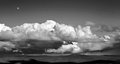
bigsky2.jpgby dustinwilsonComment by dustinwilson: I did run noise ninja on this photo..I beleive your refering to forground detail..honestly..was never much there and I considered a clean sky important since the clouds are the main subject |
| 05/07/2006 01:01:22 AM |
bigsky2.jpgby dustinwilsonComment by wavelength: I'm thinking a little much noise removal might have been used, especially when I looked at the larger size it seemed so. make sure you're not deleting essential detail just to get rid of some grain.
I could be completely off-base here. |
| Photographer found comment helpful. |
| 05/07/2006 12:57:41 AM |
bigsky2.jpgby dustinwilsonComment by dustinwilson: Yeah..I aggree that more mountains in the foreground would be better..but unfortunalty its just clutter below where I cropped. hows the processing? |
| 05/07/2006 12:54:36 AM |
bigsky2.jpgby dustinwilsonComment by ShutterPug: This is a really nice shot! Love the curves and layering of the clouds. I agree with the others that a little more fo the mountains below would be nice. The moon up high is a nice accent. |
| Photographer found comment helpful. |
| 05/07/2006 12:42:27 AM |
bigsky2.jpgby dustinwilsonComment by MrHllywd07: I like it, I think its a great shot. Might have considered getting some more of the landscape in the photo, and less sky. |
| Photographer found comment helpful. |
| 05/07/2006 12:40:25 AM |
bigsky2.jpgby dustinwilsonComment by wavelength: Could wish for some mountainst down there, the top seems a bit empty, though the moon adds a bit, I think 640 doesn't ever do 2:1 landscapes very well at all. this might look completely different at 1024 or better 1280 wide. I just can't see enough detail at this size. |
| Photographer found comment helpful. |
| 04/19/2006 10:30:37 PM |
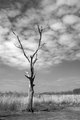
treefinished.jpgby dustinwilsonComment by cpanaioti: The tree is contrasted well with the clouds. To exploit this I think shooting from a point closer to the tree and lower to the ground would make for a more dynamic shot. |
| Photographer found comment helpful. |
| 04/19/2006 10:28:58 PM |
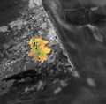
leaf.jpgby dustinwilsonComment by cpanaioti: Good texture in the rock however I feel there is either too much or too little rock in the picture. The leaf is also a little too central for me. Putting the leaf further down and to the left could increase the dynamics of the image. |
| Photographer found comment helpful. |
| 04/19/2006 10:26:19 PM |
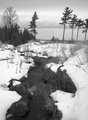
lakemi.jpgby dustinwilsonComment by cpanaioti: Exposure and contrast seem bang on, however, the presentation (to me) lacks impact. A lower point of view emphasizing the leading line of the creek I think would make the image much more dynamic. |
| Photographer found comment helpful. |
Home -
Challenges -
Community -
League -
Photos -
Cameras -
Lenses -
Learn -
Help -
Terms of Use -
Privacy -
Top ^
DPChallenge, and website content and design, Copyright © 2001-2026 Challenging Technologies, LLC.
All digital photo copyrights belong to the photographers and may not be used without permission.
Current Server Time: 07/16/2026 12:22:54 AM EDT.