| Image |
Comment |
| 11/26/2003 08:27:43 PM |
|
 Photographer found comment helpful. Photographer found comment helpful. |
| 11/26/2003 03:25:40 PM |
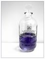
Scents of "Provence"by ParentxComment by willem: Good clean simple color combination, pulls attention to the oil. Setup could have done with some more work in terms of background and light. A large piece of paper on the table and then moving up against the wall would have removed the visible transition. Some backlight might have given some more glow to the oil. |
| 11/26/2003 02:26:50 AM |
|
| 11/18/2003 12:23:19 AM |
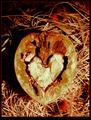
Cracked Heartby ParentxComment by ellamay: It would be important for me to know what your intention was with your shot. In my opinion it is much too central and the lighting is very harsh on it. I think in general you may want to reshoot in the shade or varying times of day, and consider the rule of thirds in respect to your composition. However, I could also see you chosing this 'harsh' composition and lighting to communicate your title, broken hearts are harsh and front and central , sort of in your face so to speak. Again, your intention with the shot is what is important.
hope that helps, I am new to the CC |
| 11/11/2003 06:56:15 PM |
|
| Photographer found comment helpful. |
| 11/11/2003 05:47:38 PM |
Cracked Heartby ParentxComment by Shannon: The darkness in the upper left corner is a bit distracting, also the uneven border does not help this photo. |
| Photographer found comment helpful. |
| 11/11/2003 01:30:23 PM |
Cracked Heartby ParentxComment by dertyklobb: A very contrived scene. But it works, I guess. I really have no other comment, I'm just not a huge fan of this kind of photography. |
| Photographer found comment helpful. |
| 11/06/2003 03:32:23 PM |
|
| Photographer found comment helpful. |
| 11/06/2003 03:39:13 AM |
Cracked Heartby ParentxComment by Tavaszka: You did it with the flash? I like the composition, perhaps the light was to strong in the middle. But maybe that's the point..:) |
| Photographer found comment helpful. |
| 11/05/2003 04:50:23 PM |
Cracked Heartby ParentxComment by scrum8: I might have tried turning the open face of the nut a little more toward the light, and off centering the it a little. It looks kind of flat and one dimensional. |
Home -
Challenges -
Community -
League -
Photos -
Cameras -
Lenses -
Learn -
Help -
Terms of Use -
Privacy -
Top ^
DPChallenge, and website content and design, Copyright © 2001-2026 Challenging Technologies, LLC.
All digital photo copyrights belong to the photographers and may not be used without permission.
Current Server Time: 07/16/2026 09:50:48 PM EDT.