| Image |
Comment |
| 10/04/2004 05:45:30 AM |
|
 Photographer found comment helpful. Photographer found comment helpful. |
| 10/03/2004 11:46:03 PM |
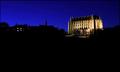
Lancing Collegeby marboComment by Neuferland: A very nice shot but the negative space on the bottom hurts this shot more than helps it to me. Too much black for a dark night shot to start with. I would have liked to have seen the building take more of the shot , it looks like a wonderful subject. A 6 |
| Photographer found comment helpful. |
| 10/03/2004 09:51:04 PM |
|
| Photographer found comment helpful. |
| 10/03/2004 04:56:08 PM |
Lancing Collegeby marboComment by kdkaboom: This is very nice, and the sky is just spectacular, but I was hoping for more of a stark silouhette with the buildings on the left. Their lights really do distract from the intense lit-up-ness (should be a word!) of the college... very nice shot, though, thanks! |
| Photographer found comment helpful. |
| 10/03/2004 02:52:31 PM |
Lancing Collegeby marboComment by shutterfly: Nice time exposure. Maybe a little to much black at the bottom, try cropping a little tighter. I think this shot might benefit without the lights from the other building. Just a suggestion. 6 |
| Photographer found comment helpful. |
| 10/03/2004 12:48:50 PM |
Lancing Collegeby marboComment by willem: Good capture of the cathedral (?), nice silhouette as well on the left. Both together, I find confusing and the big black empty space does not enhance it, in my opinion. |
| Photographer found comment helpful. |
| 10/03/2004 12:45:24 PM |
|
| Photographer found comment helpful. |
| 10/03/2004 11:53:29 AM |
Lancing Collegeby marboComment by soccerdad: Now this is great use of negative space. Not my favorite in the challenge, but this a shot that could be a postcard. Very well done. |
| Photographer found comment helpful. |
| 10/03/2004 11:33:14 AM |
Lancing Collegeby marboComment by MrAkamai: Excellent night shot and the College is illuminated quite nicely. I rather liked the silhouette in the right half of the image but not sure if the lights in the buildings were cloned out if it would look better or not. As negative space goes, your image closely adheres to the rule of thirds but I think it would look better with more sky vs empty black. 7 |
| Photographer found comment helpful. |
| 10/03/2004 10:27:36 AM |
|
| Photographer found comment helpful. |
Home -
Challenges -
Community -
League -
Photos -
Cameras -
Lenses -
Learn -
Help -
Terms of Use -
Privacy -
Top ^
DPChallenge, and website content and design, Copyright © 2001-2026 Challenging Technologies, LLC.
All digital photo copyrights belong to the photographers and may not be used without permission.
Current Server Time: 07/27/2026 05:20:04 AM EDT.