| Image |
Comment |
| 10/05/2004 11:12:54 AM |
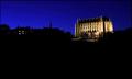
Lancing Collegeby marboComment by photom: The blue sky and building are truly superb. The bottom half of the image has no detail at all. It may be better with a lot cropped off the bottom, making it into a slim Jim format. |
 Photographer found comment helpful. Photographer found comment helpful. |
| 10/05/2004 10:56:59 AM |
|
| Photographer found comment helpful. |
| 10/05/2004 06:59:12 AM |
|
| Photographer found comment helpful. |
| 10/04/2004 11:55:37 PM |
|
| Photographer found comment helpful. |
| 10/04/2004 11:21:39 PM |
Lancing Collegeby marboComment by Kha0S: Really vivid colors on the sky! Foreground seems quite dark. Seems like there are some heavy shadows falling on the building which break up the lines of the architecture. |
| Photographer found comment helpful. |
| 10/04/2004 08:55:19 PM |
Lancing Collegeby marboComment by dsa157: I like the lighting on the building and thre dark, rickly colored night sky. I think you could have cropped out more of the silouetted featureless foreground though. |
| Photographer found comment helpful. |
| 10/04/2004 07:19:32 PM |
|
| Photographer found comment helpful. |
| 10/04/2004 04:41:56 PM |
Lancing Collegeby marboComment by graphicfunk: this image is very nice because the composition is very strong. However, the lack of clarity does not offer the reward the eye looks for. The beautiful blue sky contrasts well with the zone 1 foreground. But the center of interest does not sing. despite all this the general feel us smart and very attractive. 6 |
| Photographer found comment helpful. |
| 10/04/2004 01:45:35 PM |
Lancing Collegeby marboComment by SandyP: It certainly looks beautiful -- especially against that royal blue sky. I know hard it is to do, but I would have loved to see a little more definition in the foreground subjects -- not quite so darkened out. But it is still a great picture. 8 |
| Photographer found comment helpful. |
| 10/04/2004 08:58:57 AM |
Lancing Collegeby marboComment by mbardeen: I really like the blue sky vs the lit college. But I think you've got too much negative space on the bottom, it overpowers the rest of the image. Taking off about an inch of the black space makes this a much stronger shot, imo. |
| Photographer found comment helpful. |
Home -
Challenges -
Community -
League -
Photos -
Cameras -
Lenses -
Learn -
Help -
Terms of Use -
Privacy -
Top ^
DPChallenge, and website content and design, Copyright © 2001-2026 Challenging Technologies, LLC.
All digital photo copyrights belong to the photographers and may not be used without permission.
Current Server Time: 07/27/2026 08:54:14 PM EDT.