| Image |
Comment |
| 01/31/2003 02:15:13 PM |
Inspiredby PtmanComment by kandyj: Great angle and cropping. I might have like the sky a little desaturated if I would change anything, 9 |
 Photographer found comment helpful. Photographer found comment helpful. |
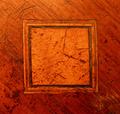
| 01/31/2003 11:28:24 AM |
Inlayby PtmanComment by inspzil: Nice colors but the general subject here doesn't have a lot of appeal to me. - Inspzil |
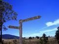
| 01/30/2003 10:47:59 PM |
Sign in Blueby PtmanComment by karmat: CRITIQUE CLUB CRITIQUE
by karmat
COMPOSITION
The composition of this is very strong. The focal point of the picture, the sign, is nicely located on the left side of the frame and points into the picture. This gives a balanced, roomy feeling, and the viewer doesn't feel like they are going to follow the sign and run out of frame. The large tree on the left provides a nice contrast to the more open side on the right. The angle of the sign matches the angle of the clouds nicely as well. If I had to suggest anything to improve this, it might to crop just a hair off of the right side because there are a few stray branch tips about half way down.
TECHNIQUE
The colors in this shot are wonderful. The deep blue provides a nice backdrop for the white sign, and the greens really fill the bottom of the frame nicely. It seems to be a touch oversharp because the ends of the branches *pop* a little more than looks natural. I also see some noise in the sky, but that may be my monitor as it is not real obvious.
OVERALL EFFECT
The sign is technically very well done. Very little can be said to improve it. I can also see this one being a nice "postcard" or wall hanging for a local inn or restaurant. It doesn't seem to be a sign that makes a strong emotional statement, but that is recognizably not the purpose for all signs. I think though, if you could have added something the shot, or had something else in it that would have helped give a "story" to it, it would have scored even higher.
Overall, a great picture, and ver well done.
karmat
|
| Photographer found comment helpful. |
| 01/30/2003 04:52:23 PM |
Inspiredby PtmanComment by karmat: I love the perspective on this, and I like how it looks crowded at the top, though ordinarily I wouldn't. Great colors and capture! |
| 01/30/2003 02:40:59 PM |
Inlayby PtmanComment by PaulMdx: Composition: Good. How about turning -45' so grain is horz?
Technical: Nice
Meets challenge: Yes
Overall impression: Very interesting photo. 7 |
| Photographer found comment helpful. |
| 01/30/2003 02:05:58 PM |
Inspiredby PtmanComment by LindaLee: Incredible architectural detail here, but the odd angle of the building/composition really throws me off. I'm not crazy about the way the sky looks either. That's a very stark blue, and seems very at odds with the obviously old building. |
| 01/30/2003 12:52:36 PM |
Inspiredby PtmanComment by FranziskaLang: challenge met. nice photo, i like it a lot. the angle and crop is very nice, and almost makes me feel dizzy. lots of lines leading you through the shot. the lighting also looks very nice and even, this must've been taken on an overcast day. which is what makes the sky look a little too blue. i suspect that you took advantage of the editing freedom of this challenge. :) i personally think having the sky blue (but not that blue) or even a real sky with subtle clouds to make it look less uniform would've worked better. your photo is still amongst my top picks :) |
| Photographer found comment helpful. |
| 01/29/2003 11:50:54 PM |
Inspiredby PtmanComment by Turbotech: Wow. This is wonderful. Now I look and say man I do nothave a chance. Wonderful composition. Crisp and clear just how I like it. :-) |
| Photographer found comment helpful. |
| 01/29/2003 07:04:20 PM |
Inspiredby PtmanComment by JEM: Strong image. Door and windows really secondary, but do fit challenge. Not sure about angle of presentation but it does catch the eye. 9 JEM |
| 01/29/2003 11:28:12 AM |
Inspiredby PtmanComment by teachme53: Nice point of view, and depth of field. You must have a very good camera. If you could have taken it at a different time of day you could have gotten some really neat shadows. Good luck. John Gill |
| Photographer found comment helpful. |
Home -
Challenges -
Community -
League -
Photos -
Cameras -
Lenses -
Learn -
Help -
Terms of Use -
Privacy -
Top ^
DPChallenge, and website content and design, Copyright © 2001-2026 Challenging Technologies, LLC.
All digital photo copyrights belong to the photographers and may not be used without permission.
Current Server Time: 07/16/2026 12:25:01 AM EDT.