| Image |
Comment |
| 04/01/2006 01:14:12 AM |
|
 Photographer found comment helpful. Photographer found comment helpful. |
| 04/01/2006 12:00:50 AM |
|
| Photographer found comment helpful. |
| 03/31/2006 11:48:40 PM |
|
| Photographer found comment helpful. |
| 03/31/2006 11:44:31 PM |
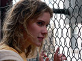
m34.jpgby stare_at_the_sunComment by tinky2: I like this ... maybe a little more light on her face, but love the look and the chain link fence. I think she has a lot of potential as a model. |
| Photographer found comment helpful. |
| 03/31/2006 11:41:35 PM |
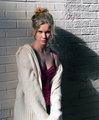
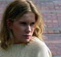
m20.jpgby stare_at_the_sunComment by Jutilda: NICE. The shadow on her face and harsh lighting make for great contrast. This series is really nice and unexpected. The rosy pink of her top works well with all of the white of the sweater and the wall. |
| Photographer found comment helpful. |
| 03/31/2006 11:34:58 PM |
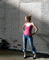
m27.jpgby stare_at_the_sunComment by Jutilda: Maybe a touch overexposed, but it doesn't really bother me. What if you just went all out and REALLY overexposed it by adjust contrast? Just a thought. I like her pose and the backdrop of the white brick wall. |
| Photographer found comment helpful. |
| 03/31/2006 11:29:39 PM |
m20.jpgby stare_at_the_sunComment by Prof_Fate: good pose, crop. lighting on the face is good - her right eye is a tad dark maybe, but that's ok. crop the top off - the white wall up there is destroying the composition - and she has to much light on the top of her head. |
| Photographer found comment helpful. |
| 03/31/2006 11:27:33 PM |
m12.jpgby stare_at_the_sunComment by Prof_Fate: pose good, light on nose good. I'd like to see about 1/2 stop more light on the shadow side of the face and scrim the head - too much top light on the hair. crop in tighter - lose the BG on the upper left. |
| Photographer found comment helpful. |
| 03/31/2006 11:26:10 PM |
m33.jpgby stare_at_the_sunComment by Prof_Fate: Bad lighting on the nose - only the tip is lit and the bridge has a shadow on it. The eyes are level - tilt the head a bit and it'll look better. a refelctor to the models right would have opened up the face a bit, or some fill flash maybe.
body position, turn of the head, the hands are all ok. i might like to see a tighter crop - show no white wall, but off center of this is good |
| Photographer found comment helpful. |
| 03/31/2006 10:38:28 PM |
|
| Photographer found comment helpful. |
Home -
Challenges -
Community -
League -
Photos -
Cameras -
Lenses -
Learn -
Help -
Terms of Use -
Privacy -
Top ^
DPChallenge, and website content and design, Copyright © 2001-2026 Challenging Technologies, LLC.
All digital photo copyrights belong to the photographers and may not be used without permission.
Current Server Time: 06/17/2026 06:11:36 PM EDT.