| Image |
Comment |
| 01/13/2003 08:14:19 AM |
|
| 01/13/2003 02:43:29 AM |
|
| 01/13/2003 01:48:19 AM |
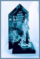
Angel - Sarah McLachlanby crabappl3Comment by jmsetzler: Greetings from the Critique Club :)
I think this is an excellent 'abstract' image. I'm not familiar with the song involved, so I don't know how well the image represents that.
I think the blue cast in this image may be slightly overpowering. I think another improvement on this shot would be in the use of background. The one little dark spot on the right edge of the frame is somewhat distracting. I usually try to avoid this unless there are many contrasts near the edge of the frame. A single element of contrast along an edge will be considered distracting in a lot of cases.
The perspective of this image, IMO, needs some 'base' so it does not give the impression that your subject is floating in mid air. Ther is some element of 'base' here but it is not very strong. I have had good luck in situations like this using darker backrounds and use my lighting to illuminated the base area a little more.
One thing I can definitely tell from this image is that you have a great emotional tie to it. There is a love displayed here that only you know and understand. I hope that the commnents and score you received by posting this image here were not hurtful. You have to take these responses with a grain of salt and keep on plugging :)
Kudos on an excellent shot :)
John Setzler
|
 Photographer found comment helpful. Photographer found comment helpful. |
| 01/13/2003 01:37:36 AM |
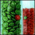
Myin & Myangby crabappl3Comment by jmsetzler: Greetings from the Critique Club :)
I really like the color in this image. I also enjoy the abstract nature of the shot created by the texture in the glass. The single red and single green pieces create a nice fit for the challenge. I also really like the way you titled this photo ;) It just makes sense to me :)
On a compositional note, I believe that creating a diagonal split between the glass containers would possibly create some more impact. Also to fit the title theme, offsetting the odd colored candy a bit would have been stronger also.
The combination of red and green work very well together in this image also. They create a nice element of contrast. I believe that contrasts are very important in most photographs. In a color or black and white image, the contrast is what usually creates the 'wow' factor, along with strong composition of the image. Color is a wonderful thing and it has been used very effectively in this image.
This image also shows me a nice 'thought' pattern from the photographer. You are thinking outside the 'box' and thinking like that usually leads to some impressive photos.
Kudos on a nice shot :)
John Setzler
|
| Photographer found comment helpful. |
| 01/13/2003 01:22:46 AM |
Texas Convenienceby crabappl3Comment by kandyj: This is great, I live in Arkansas and your likely to see the same combination here. Maybe with a beer sign added in. Too bad you can't use this for next week's challenge. |
| 01/13/2003 12:53:38 AM |
|
| Photographer found comment helpful. |
| 01/13/2003 12:37:53 AM |
|
| 01/13/2003 12:36:28 AM |
|
| 01/12/2003 01:17:30 AM |
|
| Photographer found comment helpful. |
| 01/11/2003 12:28:30 PM |
|
| Photographer found comment helpful. |
Home -
Challenges -
Community -
League -
Photos -
Cameras -
Lenses -
Learn -
Help -
Terms of Use -
Privacy -
Top ^
DPChallenge, and website content and design, Copyright © 2001-2026 Challenging Technologies, LLC.
All digital photo copyrights belong to the photographers and may not be used without permission.
Current Server Time: 06/11/2026 05:35:39 AM EDT.