| Image |
Comment |
| 01/21/2003 04:59:46 AM |
|
 Photographer found comment helpful. Photographer found comment helpful. |
| 01/21/2003 12:06:34 AM |
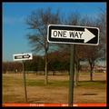
...or another!by crabappl3Comment by dodobird: I gonna find ya...... sorry just couldn't resist. Very catchy title. I really like how you drew the red color from the shot to the border, but my attention is drawn to that part of the picture first, I don't know if that was your intention or not. I like the depth both of the signs create (the fire lane does help with this also), and you kept the 2nd sign in focus, I like that. There is something that bothers me about the colors though, mabey a bit too yellow, can't totally put my finger on it right now. Was it a hazy day? There is also red spots all through the trees which doesn't look natural, you may have over saturated the red a bit too much. I figured you saturated it to get the effect with the fire lane. If you did, that may also be causing the color problem.
Overall I like the effect with the fire lane, but I feel your colors were a bit off. Thanks for reading my ramblings. 8. |
| Photographer found comment helpful. |
| 01/20/2003 07:50:26 PM |
|
| 01/20/2003 07:13:07 PM |
|
| 01/20/2003 06:39:26 PM |
|
| Photographer found comment helpful. |
| 01/20/2003 06:10:36 PM |
|
| Photographer found comment helpful. |
| 01/20/2003 02:47:41 PM |
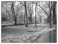
Winter Serenityby crabappl3Comment by indigo997: Well... That's quite a snow for Texas! This photo doesn't really have any glaring problems, but it isn't as strong as many of the other submissions. It IS rather understated and serene which doesn't help it stand out from the crowd. I really like the sidewalk, but it just isn't very obvious in B&W. I actually think that you could move a little, showing more of the sidewalk, and make it a stronger element in the image. I'm still not sure that I like this in black and white. Did you take it in color and then convert it? B&W can often add drama to a landscape, but IMO it makes this photo seem a little too lifeless and blah. Since you obviously have ready access to this site, I would suggest going back in spring, summer (maybe even during a rain shower), and fall to take the same shot from the same spot. Putting them side by side and showing how much it changes would be very interesting. |
| Photographer found comment helpful. |
| 01/20/2003 12:59:45 PM |
Fortifiedby crabappl3Comment by Swashbuckler: Everything works, except for the milk droplet at the end of the needle. (it's slightly out of focus). Great, strong color! Good eye catching appeal. Ever so slightly too tight of cropping on both sides. 8 Swash |
| Photographer found comment helpful. |
| 01/20/2003 11:19:57 AM |
|
| Photographer found comment helpful. |
| 01/20/2003 10:16:49 AM |
...or another!by crabappl3Comment by irae: Good catch, and the square format is working for me. I'm absolutely not feeling that orange inner border, though. Too constricting, and stops the apparent 'motion' of the signs. |
| Photographer found comment helpful. |
Home -
Challenges -
Community -
League -
Photos -
Cameras -
Lenses -
Learn -
Help -
Terms of Use -
Privacy -
Top ^
DPChallenge, and website content and design, Copyright © 2001-2026 Challenging Technologies, LLC.
All digital photo copyrights belong to the photographers and may not be used without permission.
Current Server Time: 06/11/2026 08:52:45 AM EDT.