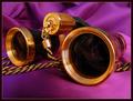
Night at the Operaby
crabappl3Comment by Lustre: Critique Club
Composition: In general I like the composition. I think it's perhaps cropped too tightly on the sides. I certainly like the angle of the glasses. I would have liked to see a little more of the rope/chain. The colour of the background is very plush and appropriate to the subject, plus it complements the glasses very well.
Technical Quality: The focus and depth of field are very good in this photo. The lighting works very well (I'm a big fan of "ghetto" lighting if you check out my "The Hunter" photo). I find the reflection in the lenses slightly distracting.
Meeting the Challenge: I think this qualifies as a macro nicely. Initially I thought they were old binoculars, but since they are opera glasses then you are certainly zoomed in.
Creativity: Your choice of background was very wise, and the title is lovely. Overall, it's an elegant photo that is fitting of a "Night at the Opera"
Border: The subtle gold line and black outer work well to frame the image without distracting the viewer. The black obviously sits well with the blackness of the glasses body.
Overall: A very well executed photo. Not the most extreme macro in the world, but close enough for me. Technically you have done very well and all elements of the photo compliment each other (title, colour, border, composition). If you have the width available on the original try cropping it slightly wider at the sides.