Cheaters Handby
gr8daneComment by CEJ: Hello from the Critique Club!
I have studied your image and have the following to offer:
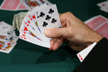
Composition/perspective - the view onto this shot is nice. It allows for a first hand view of the subject hand. The background is a little busy. Too many extra hands of cards with no attachment to anything as well as the money that is mostly hidden. Removing some of the cards and the money would remove some of the distraction. The focus is good in the foreground while the background is sufficiently blurred for the effect - good DoF. Position of the subject hand in the shot is a good application of the rule of thirds. The processing seems a little severe - the sleeve of the jacket looks painted in or more like you would want a background to appear. But for a jacket it is too smooth and lacks any detail whatsoever. This close to the sleeve I would expect to see at least a little of the detail of the weave of the fabric or slight variations in the surface. None of this is present.
Color - the colors here are good. They all seem to retain their original hue without being overbearing or over processed. The skin tones appear in the right range. The numbers on the cards appear solid with no blending or fringing into the white (more processing than anything).
Lighting - this may have hurt the image some. There are many conflicting shadows on the table which come across as distractions. There appears to be at least three, possibly four different shadow sets - too many. Also, the brightness of the lights may have caused you to process your levels a bit too much which is what caused the sleeve to appear somewhat fake. Perhaps adjusting the exposure (apperture/shutter speed) would have helped this and allowed the processing to be less severe which would have allowed more detail to be retained in the sleeve.
Challenge requirements - it meets the challenge requirements, but it may have been another area where it fell short. The subject was repeated many times in the challenge so an image would need something to really make it pop to stand out among all the others.
Overall/my opinion - with better lighting and less clutter on the table this would have been a stronger image. The distractions hold attention for too long and take away from the focus of the subject.