| Image |
Comment |
| 01/05/2006 02:34:18 PM |
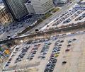
CityLife_Torontoby laindComment by ShannonLee: cool angle...dif than many of the other shots i've seen so far. it does portray city life however it's not very visually appealing, just a bunch of cars |
 Photographer found comment helpful. Photographer found comment helpful. |
| 01/05/2006 09:33:34 AM |
|
| Photographer found comment helpful. |
| 01/04/2006 11:38:50 PM |
CityLife_Torontoby laindComment by LaMerry: I think the resizing (if it was it) was not a very good idea.... It's a good photo, great lighting, nice composition, but the quality... it could be better... |
| Photographer found comment helpful. |
| 01/04/2006 08:48:16 PM |
|
| Photographer found comment helpful. |
| 01/04/2006 07:13:10 PM |
|
| Photographer found comment helpful. |
| 01/04/2006 05:14:45 PM |
CityLife_Torontoby laindComment by notonline: Nice shot but the size plays a very important part. Its a little on the small side. If you need help with resizing and saving PM me and I will walk you thru the steps to get a larger size photo for the challenge for the viewers. |
| Photographer found comment helpful. |
| 01/04/2006 07:06:33 AM |
|
| Photographer found comment helpful. |
| 01/04/2006 01:23:06 AM |
CityLife_Torontoby laindComment by _eug: Challenge
- Relevant to the Challenge? Yes
- Is subject unique (vs. unoriginal or rehashed)? Yes
Compostion
- Good or Bad? How can it be fixed? Bad. Rotate so that the tracks go diagonally across the image or have them straight. Actually, I just spotted the road going diagnal. Make the rails go straight accross. The high viewpoint is a challenging composition, because we are not used to seeing things from this angle.
- Is there anything that should be removed? The are several bits along the edges that draw the eye away.
- Is there anything missing? A focal point. What should me eye be drawn to?
What is my reaction or feelings? It doesn't really grab me. I like high viewpoint images, because they are unusual, but there is no hook in this image. |
| Photographer found comment helpful. |
| 12/31/2005 01:25:49 AM |
Garlicby laindComment by Tammer: I'd like to see what this would look like a bit larger (using the max. 640 pixels allowed) and also a bit sharper. I do like the lighting and blue tones though. |
| 12/29/2005 05:11:37 AM |
Rangoliby laindComment by AndrewTO: Nice. using different background and a boost to color saturation would help (6) |
Home -
Challenges -
Community -
League -
Photos -
Cameras -
Lenses -
Learn -
Help -
Terms of Use -
Privacy -
Top ^
DPChallenge, and website content and design, Copyright © 2001-2026 Challenging Technologies, LLC.
All digital photo copyrights belong to the photographers and may not be used without permission.
Current Server Time: 07/15/2026 11:25:04 PM EDT.