| Image |
Comment |
| 12/07/2005 06:00:11 AM |
First Dayby manic35Comment by Falc: Oh brilliant - just that table in the upper left needs flipping. I'd also prefer to see the model looking into the frame as opposed to out of the frame. |
 Photographer found comment helpful. Photographer found comment helpful. |
| 12/07/2005 05:40:55 AM |
First Dayby manic35Comment by samtrundle: Whoa... I almost think you cranked the saturation a little far (the almost neon shirt is a bit of a giveaway) but nevertheless I like the colours and the composition (aside from the little bit of black in the top right corner. 9. |
| Photographer found comment helpful. |
| 12/07/2005 03:40:19 AM |
First Dayby manic35Comment by gerakdepan: This is good. Perhaps if you widened the angle and make the subject smaller in the sea of red chairs the sense of too early would be even greater. Very good composition with chairs diagonally lined. Top of the picture could have been cropped more. I'm also still learning. Hope you find his helpful. |
| Photographer found comment helpful. |
| 12/07/2005 02:20:15 AM |
|
| Photographer found comment helpful. |
| 12/07/2005 12:43:10 AM |
First Dayby manic35Comment by Jutilda: WOW the intense colors and sharpness is amazing. Great leading line with all of the rows of the chairs. His blue shirt mimics the tone of the wall. I'd work on his skin tones and make them yes yellow, or maybe you wanted his arms to match the gold of the chair arms. Still - a vivid eye catching image. Nice job. |
| Photographer found comment helpful. |
| 12/07/2005 12:33:04 AM |
First Dayby manic35Comment by sestevens: Good concept, enjoy the photo. Two recommendations. Lost of focus on the first row of seats, would consider cropping just above the "desks" of the first row. Secondly, is the top of the photography. The black sliver of ceiling showing up on the right hand side, combined with the askew vertical lines are distracting. Rotating your photo with some more acute cropping could really increase the quality of your photo. |
| Photographer found comment helpful. |
| 12/06/2005 09:18:20 PM |
|
| Photographer found comment helpful. |
| 12/06/2005 05:26:37 PM |
|
| Photographer found comment helpful. |
| 12/06/2005 07:01:46 AM |
|
| Photographer found comment helpful. |
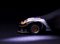
| 12/02/2005 10:42:17 PM |
The Pride of My Husband's Slot Car Collectionby manic35Comment by rick13601: Very cool pic...I know its a model, but I love the spot light and the drape over the car. It makes the model appear larger than it is. For the collection theme, I wonder if you could have achieved the same effect by using more than one car. |
| Photographer found comment helpful. |
Home -
Challenges -
Community -
League -
Photos -
Cameras -
Lenses -
Learn -
Help -
Terms of Use -
Privacy -
Top ^
DPChallenge, and website content and design, Copyright © 2001-2026 Challenging Technologies, LLC.
All digital photo copyrights belong to the photographers and may not be used without permission.
Current Server Time: 05/31/2026 03:16:38 AM EDT.